Using Graphs and Charts in Windows Store Apps – Boredom Challenge Day 11

Standard

Graphs and charts are very effective tools for visualizing and summarizing data for our users. In apps they not only look cool, but also can be made interactive for further effectiveness. They are also an indispensible feature of financial apps or apps which need to show statistics.

1

In Windows Store apps, there isn’t a default XAML control in Visual Studio for graphs. However, we can easily use other libraries such as WinRT XAML Toolkit or Telerik RadControls for Windows 8 (there are many more). In this article we will create a sample app which uses different types of graphs and charts to show example data (pie chart, bar chart, line chart etc.) using WinRT XAML Toolkit.

➤ Bonus points for creating a “pie chart of my favorite bars” and “bar chart of my favorite pies”…

Advertisement

Using Multiple Item Templates Together: DataTemplateSelector – Boredom Challenge Day 9

Standard

If you spend some time developing Windows Store apps, you will notice that item templates play a major role since we have to use them to display data in many controls (most used ones are GridView and ListView). They give us total control over how we should present information to user, and if designed right, they can single-handedly make our app quite beautiful.

However, as you progress, you will also notice that sometimes just creating an item template is not enough: You may need to customize them based on the data you have. For this purpose, we can do several things that I’ve mentioned in my blog, such as using IValueConverter to bind your data to nearly every property, or creating a custom user control and using it in the item template. Still, however, if the amount of customization you need to do in the item template is way too much, you can instead decide to create several different item templates, and then use them at the same time via the DataTemplateSelector interface.

Screenshot from the example app we will create.

Screenshot from the example app we will create.

If this looks interesting to you, read on and we will create an app that uses the DataTemplateSelector interface. 🙂

➤ You can also use this for multiple GroupStyle or ItemContainerStyle items, but that is a little more advanced topic…

Creating and Using Custom User Controls in Windows Store Apps – Boredom Challenge Day 7

Standard

In a software, user controls are the building blocks of the user interface. A user control is basically a piece of interface and code mixture that is designed for a specific action or purpose, and they provide the interaction between users and our app. They range from simple textblocks to more complex ones such as buttons, sliders, scrollbars, lists and grids, or to even more complex ones such as webviews, maps, pie charts or graphs. As developers, we can customize these user controls as much as they allow, like changing their texts, colors, sizes or even events (like what happens when we click a button or move a slider).

Another aspect of user controls is this: They are repeated a lot. Think what would happen if you wanted to put a button to your app but there weren’t any button controls. You would need to put a rectangle first, then a textblock in front of it, then set a click event, then arrange it’s animations for clicking and so on. Just for one button. Then if you wanted to put another button, you would need to copy all that you’ve prepared and paste it to the place you want, which would result in an absurdly big markup code composed completely of basic controls and a maintenance nightmare.

Some of the XAML user controls in Windows Store apps.

Ok then, now that we know what user controls are and why they’re nice, we’ll come to the custom user control part. Well, apart from default user controls, you can broaden the number of your user controls via adding other libraries (for Windows Store apps, like WinRT XAML Toolkit, Telerik RadControls for Windows 8 or Bing Maps control). However, you might still have a specific part of your interface (unique to your needs) that you need to repeat a lot. If this is the case, we can create a custom user control composed of other user controls that will make our work a lot easier.

Before going on to make an example app, I’d like to make it clear how custom controls are useful in Windows Store apps:
– They increase maintainability. If you want to change how it looks or works later, just make your changes to the custom user control, instead of not using a user control and changing it in every place you’ve used.
– Combined with data binding, they can be very powerful and dynamic.
– Especially useful in places where you don’t have a codebehind file, such as the item templates for gridviews or listviews. Without them, you will not be able to easily put buttons or other interactive user controls in your item template.

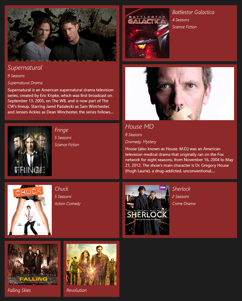
Alright alright, enough ranting, let’s create an example app. 🙂 We’ll now create a Windows Store app which will have a custom user control in a GridView item template. It will be a mockup app, where we will show the user his/her incoming friendship requests and the user will either accept or ignore them. 🙂

➤ For bonus points, you can create custom controls and put them on the internet for other people to use…

Mixing Light and Dark Themes in a Windows Store App – Boredom Challenge Day 2

Standard

When developing a Windows Store app, you get to set the default theme of you app, Dark or Light. This value determines the system brush resources for your app – therefore the colors of your controls. The theme is set in the App.xaml file, and can not be changed in runtime; so we need to pick a theme and stick with it.

An app in Dark theme.

An app in Dark theme.

The same app in Light theme.

The same app in Light theme.

This is generally not a problem, but as you can guess sometimes you may need to mix things up a little. For example, in your Dark themed app, you may need to have a page with a white background, or if you have a custom background (like a picture), some of your controls may be unseen on a specific part of the picture. When this happens, it can result in your control not being easily seen (or not being seen at all).

To fix this for simple controls that do not have states (like a textblock), just setting the foreground will be enough. However, if you wish to change the color of a more complex control, such as a button, after changing it’s foreground – background – border colors you’ll see that either a) it partially works but the button is not entirely visible when you hover over it, click it, or when it is disabled and thus looks bad, or b) it doesn’t work at all.

The same app, when themes collide.

The same app, when themes collide.

After spending 2 hours just for the color of single button, I have found a solution (which is definitely not elegant, but it works), and in this article we will make an example app that demonstrates how we can mix these two themes.

➤ Let’s make our app look like Yin Yang ☯☯☯☯☯☯☯☯☯☯☯☯☯☯☯

Making Simple Animations with Blend in Windows Store Apps

Standard

When making an application, using animations is a good way to impress the user and make your application look better. Either for making a more lively menu with sliding buttons or adding some visual effects to the background, animations come as a very simple yet powerful tool for good looking applications. In this article we will be developing a Windows Store application that contains several different animations which show several different features.

I will explain how animations work as we build our application, so we will start with opening up Visual Studio and creating a new Windows Store app.

1

In the MainPage.xaml, add a button which will be used to start the animation.

    <Grid Background="{StaticResource ApplicationPageBackgroundThemeBrush}">
        <Button x:Name="startAnimationButton" Content="Let the show begin" HorizontalAlignment="Left" Margin="100,100,0,0" VerticalAlignment="Top"/>
    </Grid>

Then, right-click MainPage.xaml and select “Open in Blend”.

2

➤ Let’s see what we can make with animations…

Using IValueConverter in Windows Store Apps

Standard

When using data binding, we may sometimes want to alter the data before presenting it to user, or we may want to change the appearance of something based on the value of the data. For example, assuming we are binding a date value, we may want to change its formatting, or we may want to change the background color based on whether the date is before or after the current date, or even show something special on certain dates (such as flowers on February 14th).

When we bind a list of items to a control (such as GridView or ListView), we can not edit individual templates of the items. We may also be getting our data from another source, such as a webservice, so we may not have control over the data we receive. So, in order to implement the features I’ve explained on the previous paragraph, we will need to use IValueConverter interface, which provides exactly what we need. In this article, we will be developing a Windows Store application that uses the IValueConverter interface.

We’ll start by opening Visual Studio and creating a new Windows Store Blank App project. I’m naming the project IValueConverterApp.

1

For this example, we will have a list of students. Our students will have a grade between 0 and 100. Our application will display these students, but their grades will need to be in letters (between FF and AA), the item color will be different based on the grade (100 – 80 will be green, 79 – 60 will be orange, and 59 – 0 will be red), and if the grade is 100 we will put a star next to the student’s name.

➤ Let’s see how we can use IValueConverter…

Windows 8 GridView GroupedHeaders with Semantic Zoom

Standard

Hi everyone,

In Windows Store applications, GridView control provides us a visually attractive, flexible and customizable way of presenting our data to the users. Although we can edit the ItemTemplate to show each item the way we want, there may be situations where we need to use more advanced features of the GridView. One of these situations is when we wish to group our data (dynamically), and put headers on top of the groups. Here’s an example, grouped by their month and year:

1

As you can see, this functionality can come in handy in many situations. However, before going on to explain how we can do this, there is another issue we should think of. What if we have a lot of items in our GridView, or the user wishes to look at an item at last group (in the previous example, the earliest date)? In that case, the user would need to do a good amount of scrolling, and that reduces the usability for our application. To prevent this in our Windows Store apps, we can use semantic zoom.

2

Semantic zoom allows the user to see the categories of the items with a pinch move (or with ctrl + mousewheel), and then select them to go directly to that group. In the example, you can see that items are grouped by their month and years. We can add semantic zoom to our grouped gridview so the users can select and go directly to their desired group.

➤ Let’s see how we can use grouped headers and semantic zoom…