
Graphs and charts are very effective tools for visualizing and summarizing data for our users. In apps they not only look cool, but also can be made interactive for further effectiveness. They are also an indispensible feature of financial apps or apps which need to show statistics.

In Windows Store apps, there isn’t a default XAML control in Visual Studio for graphs. However, we can easily use other libraries such as WinRT XAML Toolkit or Telerik RadControls for Windows 8 (there are many more). In this article we will create a sample app which uses different types of graphs and charts to show example data (pie chart, bar chart, line chart etc.) using WinRT XAML Toolkit.
We’ll begin by creating a blank Windows Store app in Visual Studio, as always.

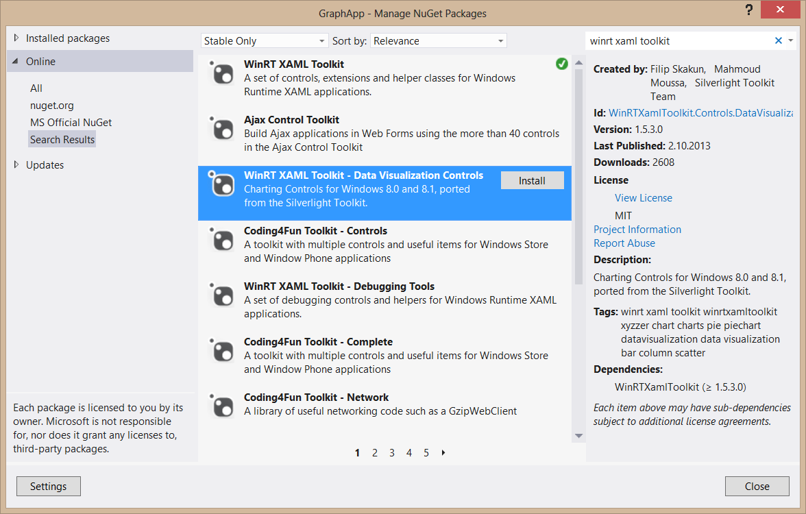
Then we will add WinRT Xaml Toolkit to our project via NuGet. Right-click References in Solution Explorer, select Manage NuGet Packages, search for WinRT Xaml Toolkit and install both “WinRT Xaml Toolkit” and “WinRT Xaml Toolkit Data Visualization Controls”.
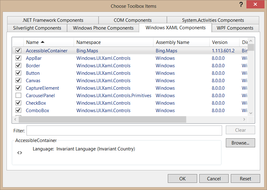
Now, for ease of use, we can put the new controls we get from WinRT Xaml Toolkit to our Toolbox in Visual Studio. To do this, open up Toolbox, right-click and select “Add Tab” and name it WinRT Xaml Toolkit. Then right click the newly added Tab and select “Choose New Items”.


In the window that opens, click Browse and select the following file in your projects folder: “packages\WinRTXamlToolkit.Controls.DataVisualization.1.5.3.0\lib\netcore45\WinRTXamlToolkit.Controls.DataVisualization.dll” (I’m not sure but I’m guessing netcore45 and netcore451 folders are the difference between Windows 8 and Windows 8.1. I selected netcore45 folder since I’m using Windows 8. If you’re using Windows 8.1, try netcore451 folder). After adding it, you’ll see that several controls have been added to the list; now click “Ok” and you’ll see these new controls in the Toolbox, under WinRT Xaml Toolkit tab.

Now, in MainPage.xaml, we’ll add an empty Chart (without defining its type). To do this, drag and drop a Chart control from the Toolbox and Visual Studio will automatically add the necessary reference. If anything goes wrong and Visual Studio doesn’t add it automatically, you can do it manually via adding ‘xmlns:Charting=”using:WinRTXamlToolkit.Controls.DataVisualization.Charting”‘ in the Page item. Anyway, an empty chart will look like this (I named it PieChart because we’ll make it a pie chart at the next step):
<Page
    xmlns:Charting="using:WinRTXamlToolkit.Controls.DataVisualization.Charting"
    x:Class="GraphApp.MainPage"
    xmlns="http://schemas.microsoft.com/winfx/2006/xaml/presentation"
    xmlns:x="http://schemas.microsoft.com/winfx/2006/xaml"
    xmlns:local="using:GraphApp"
    xmlns:d="http://schemas.microsoft.com/expression/blend/2008"
    xmlns:mc="http://schemas.openxmlformats.org/markup-compatibility/2006"
    mc:Ignorable="d">

    <Grid Background="{StaticResource ApplicationPageBackgroundThemeBrush}">
        <Charting:Chart x:Name="PieChart" HorizontalAlignment="Left" VerticalAlignment="Top" Margin="100,100,0,0" Width="400" Height="400">
        </Charting:Chart>
    </Grid>
</Page>
To make it a pie chart, we have to add a PieSeries in Chart.Series, like the following:
        <Charting:Chart x:Name="PieChart" HorizontalAlignment="Left" VerticalAlignment="Top" Margin="100,100,0,0" Width="400" Height="400">
            <Charting:PieSeries Margin="0" IndependentValuePath="Name" DependentValuePath="Amount" IsSelectionEnabled="True"/>
        </Charting:Chart>
The IndependentValuePath determines what we want to show on the item, like its name, and DependentValuePath determines the value that item will have in the graph.
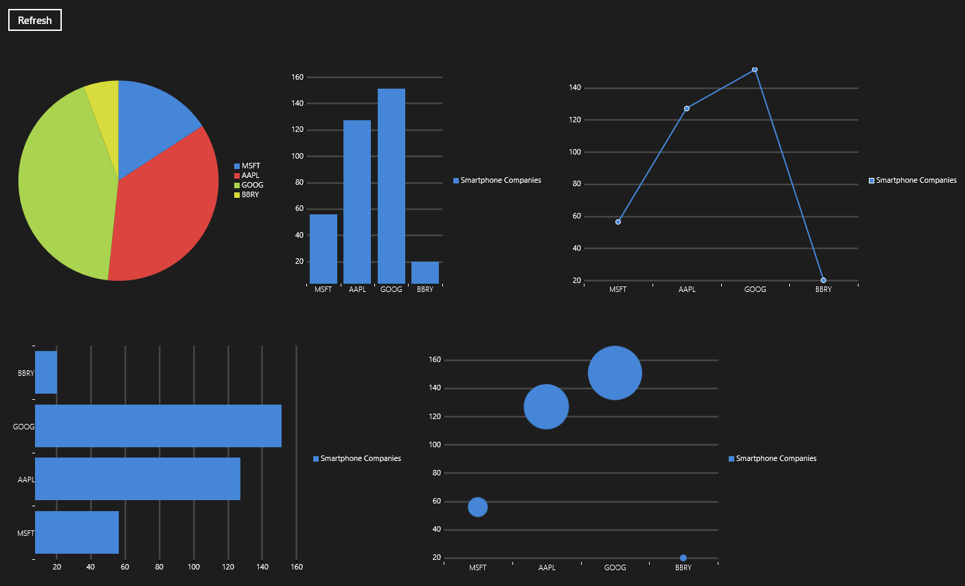
To demonstrate the graphs in WinRT Xaml Toolkit, I added several different graphs and a button to randomize the values in MainPage.xaml, which will look like this:
    <Grid Background="{StaticResource ApplicationPageBackgroundThemeBrush}">
        <Charting:Chart x:Name="PieChart" HorizontalAlignment="Left" VerticalAlignment="Top" Margin="100,100,0,0" Width="400" Height="400">
            <Charting:PieSeries Margin="0" IndependentValuePath="Name" DependentValuePath="Amount" IsSelectionEnabled="True"/>
        </Charting:Chart>
        <Button x:Name="ButtonRefresh" Content="Refresh" HorizontalAlignment="Left" Margin="100,57,0,0" VerticalAlignment="Top" Click="ButtonRefresh_Click"/>
        <Charting:Chart x:Name="ColumnChart" HorizontalAlignment="Left" VerticalAlignment="Top" Margin="505,100,0,0" Width="399" Height="400">
            <Charting:ColumnSeries Title="Smartphone Companies" Margin="0" IndependentValuePath="Name" DependentValuePath="Amount" IsSelectionEnabled="True"/>
        </Charting:Chart>
        <Charting:Chart x:Name="LineChart" HorizontalAlignment="Left" VerticalAlignment="Top" Margin="909,100,-143,0" Width="600" Height="400">
            <Charting:LineSeries Title="Smartphone Companies" Margin="0" IndependentValuePath="Name" DependentValuePath="Amount" IsSelectionEnabled="True"/>
        </Charting:Chart>
        <Charting:Chart x:Name="BarChart" HorizontalAlignment="Left" VerticalAlignment="Top" Margin="100,505,0,-137" Width="600" Height="400">
            <Charting:BarSeries Title="Smartphone Companies" Margin="0" IndependentValuePath="Name" DependentValuePath="Amount" IsSelectionEnabled="True"/>
        </Charting:Chart>
        <Charting:Chart x:Name="BubbleChart" HorizontalAlignment="Left" VerticalAlignment="Top" Margin="705,505,0,-137" Width="600" Height="400">
            <Charting:BubbleSeries Title="Smartphone Companies" Margin="0" IndependentValuePath="Name" DependentValuePath="Amount" IsSelectionEnabled="True"/>
        </Charting:Chart>
    </Grid>
Let’s add some example data in our MainPage.xaml.cs to see how the graphs look. To do this, we create a custom class called FinancialStuff with Name and Amount values in it, and then put several FinancialStuff objects to our graph with random values:
using WinRTXamlToolkit.Controls.DataVisualization.Charting;
        public class FinancialStuff
        {
            public string Name { get; set; }
            public int Amount { get; set; }
        }

        public MainPage()
        {
            this.InitializeComponent();
            this.Loaded += MainPage_Loaded;
        }

        void MainPage_Loaded(object sender, RoutedEventArgs e)
        {
            LoadChartContents();
        }

        private void LoadChartContents()
        {
            Random rand = new Random();
            List<FinancialStuff> financialStuffList = new List<FinancialStuff>();
            financialStuffList.Add(new FinancialStuff() { Name = "MSFT", Amount = rand.Next(0, 200) });
            financialStuffList.Add(new FinancialStuff() { Name = "AAPL", Amount = rand.Next(0, 200) });
            financialStuffList.Add(new FinancialStuff() { Name = "GOOG", Amount = rand.Next(0, 200) });
            financialStuffList.Add(new FinancialStuff() { Name = "BBRY", Amount = rand.Next(0, 200) });
            (PieChart.Series[0] as PieSeries).ItemsSource = financialStuffList;
            (ColumnChart.Series[0] as ColumnSeries).ItemsSource = financialStuffList;
            (LineChart.Series[0] as LineSeries).ItemsSource = financialStuffList;
            (BarChart.Series[0] as BarSeries).ItemsSource = financialStuffList;
            (BubbleChart.Series[0] as BubbleSeries).ItemsSource = financialStuffList;
        }

        private void ButtonRefresh_Click(object sender, RoutedEventArgs e)
        {
            LoadChartContents();
        }
Note: We’ve reached the corresponding series via the chart, like “(PieChart.Series[0] as PieSeries)” because when I give a name to the PieSeries and call it directly it is null for some reason.
Anyway, when we run it, we’ll see randomly valued charts like this:
One final trick I want to show you is that currently, when you refresh the items, you’ll see that the pie chart colors change. We can avoid this by adding our own palette to PieChart, like the following (solution found from here):
       <Charting:Chart x:Name="PieChart" HorizontalAlignment="Left" VerticalAlignment="Top" Margin="100,100,0,0" Width="400" Height="400">
            <Charting:Chart.Series>
                <Charting:PieSeries Title="Things I Like" Margin="0" IndependentValuePath="Name" DependentValuePath="Amount" IsSelectionEnabled="True"/>
            </Charting:Chart.Series>
            <Charting:Chart.Palette>
                <Charting:ResourceDictionaryCollection>
                    <!-- Blue -->
                    <ResourceDictionary>
                        <SolidColorBrush
                    x:Key="Background"
                    Color="#FF4586D8" />
                        <Style
                    x:Key="DataPointStyle"
                    TargetType="Control">
                            <Setter
                        Property="Background"
                        Value="{StaticResource Background}" />
                        </Style>
                        <Style
                    x:Key="DataShapeStyle"
                    TargetType="Shape">
                            <Setter
                        Property="Stroke"
                        Value="{StaticResource Background}" />
                            <Setter
                        Property="StrokeThickness"
                        Value="2" />
                            <Setter
                        Property="StrokeMiterLimit"
                        Value="1" />
                            <Setter
                        Property="Fill"
                        Value="{StaticResource Background}" />
                        </Style>
                    </ResourceDictionary>
                    <!-- Red -->
                    <ResourceDictionary>
                        <SolidColorBrush
                    x:Key="Background"
                    Color="#FFDC443F" />
                        <Style
                    x:Key="DataPointStyle"
                    TargetType="Control">
                            <Setter
                        Property="Background"
                        Value="{StaticResource Background}" />
                        </Style>
                        <Style
                    x:Key="DataShapeStyle"
                    TargetType="Shape">
                            <Setter
                        Property="Stroke"
                        Value="{StaticResource Background}" />
                            <Setter
                        Property="StrokeThickness"
                        Value="2" />
                            <Setter
                        Property="StrokeMiterLimit"
                        Value="1" />
                            <Setter
                        Property="Fill"
                        Value="{StaticResource Background}" />
                        </Style>
                    </ResourceDictionary>
                    <!-- Yellow -->
                    <ResourceDictionary>
                        <SolidColorBrush
                    x:Key="Background"
                    Color="#FFD6DC3B" />
                        <Style
                    x:Key="DataPointStyle"
                    TargetType="Control">
                            <Setter
                        Property="Background"
                        Value="{StaticResource Background}" />
                        </Style>
                        <Style
                    x:Key="DataShapeStyle"
                    TargetType="Shape">
                            <Setter
                        Property="Stroke"
                        Value="{StaticResource Background}" />
                            <Setter
                        Property="StrokeThickness"
                        Value="2" />
                            <Setter
                        Property="StrokeMiterLimit"
                        Value="1" />
                            <Setter
                        Property="Fill"
                        Value="{StaticResource Background}" />
                        </Style>
                    </ResourceDictionary>
                    <!-- Green -->
                    <ResourceDictionary>
                        <SolidColorBrush
                    x:Key="Background"
                    Color="#FFAAD34F" />
                        <Style
                    x:Key="DataPointStyle"
                    TargetType="Control">
                            <Setter
                        Property="Background"
                        Value="{StaticResource Background}" />
                        </Style>
                        <Style
                    x:Key="DataShapeStyle"
                    TargetType="Shape">
                            <Setter
                        Property="Stroke"
                        Value="{StaticResource Background}" />
                            <Setter
                        Property="StrokeThickness"
                        Value="2" />
                            <Setter
                        Property="StrokeMiterLimit"
                        Value="1" />
                            <Setter
                        Property="Fill"
                        Value="{StaticResource Background}" />
                        </Style>
                    </ResourceDictionary>
                </Charting:ResourceDictionaryCollection>
            </Charting:Chart.Palette>
        </Charting:Chart>
With this code our pie chart colors will be only blue, red, yellow and green. Keep in mind that if the number of colors and the number of items are not the same, they will start changing with each refresh (the colors are iterated starting after the last used one). Also, if you have less colors than the number of items in the graph, some of the colors will be repeated. ObservableCollection doesn’t seem to work to fix this.
Also, if you want to further customize these charts, you can edit their styles to fit them to your needs. I haven’t tried it, but if you’re interested, this post can be good place to start.
Here‘s the source code of our example.
Thank you for reading. 🙂
 Alp Arslan Eren
How to change colours of a Charting:LineSeries (graph with lines)? Thank you!
You can change the colors of the line chart the same way we changed the colors of the pie chart, by adding a Charting:Chart.Palette under it.
For example, this would make the line chart red:
        <Charting:Chart x:Name="LineChart" HorizontalAlignment="Left" VerticalAlignment="Top" Margin="909,100,-143,0" Width="600" Height="400">
            <Charting:LineSeries Title="Smartphone Companies" Margin="0" IndependentValuePath="Name" DependentValuePath="Amount" IsSelectionEnabled="True"/>
            <Charting:Chart.Palette>
                <Charting:ResourceDictionaryCollection>
                    <!-- Red -->
                    <ResourceDictionary>
                        <SolidColorBrush
                    x:Key="Background"
                    Color="#FFDC443F" />
                        <Style
                    x:Key="DataPointStyle"
                    TargetType="Control">
                            <Setter
                        Property="Background"
                        Value="{StaticResource Background}" />
                        </Style>
                        <Style
                    x:Key="DataShapeStyle"
                    TargetType="Shape">
                            <Setter
                        Property="Stroke"
                        Value="{StaticResource Background}" />
                            <Setter
                        Property="StrokeThickness"
                        Value="2" />
                            <Setter
                        Property="StrokeMiterLimit"
                        Value="1" />
                            <Setter
                        Property="Fill"
                        Value="{StaticResource Background}" />
                        </Style>
                    </ResourceDictionary>
                </Charting:ResourceDictionaryCollection>
            </Charting:Chart.Palette>
        </Charting:Chart>
And if you have multiple lines, you can add multiple colors to the palette in the order you want them to be shown. 🙂
Hello,
Thanks for describing about line chart. I have read above example.
I want to separate out both color. Occurrence Point color and line color.
How can I set Occurrence Point Color?
Thank you
How can we control the width on individual bars in a bar chart ? And also can you please suggest ways to handle the legends and its positioning in the graphs .
Hi there,
The answer is going to be long, so bear with me. 🙂 I assumed you meant column chart (the vertical one) and worked on that, but everything I explain here can be applied to other charts as well.
First of all, we can control the width of individual items in the chart, but that is not very simple. This is because the width is determined by the style (and template) applied to them, and therefore when we make a change to the style it is applied to every item in the series, looking like this:
If you want each item to have different widths, you need to use IValueConverter within the chart item’s style, and give the widths of the item depending on a value (for example, the index of the item). This way, you can make it look like the following:
To do this, you have to add an IndexToWidthConverter class which implements IValueConverter interface, create a custom Style for the DataPointStyle of the series and use that class there. The code will look like this (by the way, I’ll provide the whole working project at the end):
using System;
using System.Collections.Generic;
using System.Linq;
using System.Text;
using System.Threading.Tasks;
using Windows.UI.Xaml.Data;

namespace GraphApp
{
    public class IndexToWidthConverter : IValueConverter
    {
        static int currentItemIndex = 0;
        public object Convert(object value, Type targetType, object parameter, string language)
        {
            if (value != null)
            {
                switch (currentItemIndex)
                {
                    case 0:
                        {
                            currentItemIndex++;
                            return 10;
                        }
                    case 1:
                        {
                            currentItemIndex++;
                            return 20;
                        }
                    case 2:
                        {
                            currentItemIndex++;
                            return 30;
                        }
                    case 3:
                        {
                            currentItemIndex = 0;
                            return 40;
                        }
                    default:
                        {
                            currentItemIndex = 0;
                            return 100;
                        }
                }
            }
            else
            {
                return 0;
            }
        }
        public object ConvertBack(object value, Type targetType, object parameter, string language)
        {
            throw new NotImplementedException();
        }
    }
}
<Page x:Class="GraphApp.MainPage" xmlns="http://schemas.microsoft.com/winfx/2006/xaml/presentation" xmlns:x="http://schemas.microsoft.com/winfx/2006/xaml" xmlns:local="using:GraphApp" xmlns:d="http://schemas.microsoft.com/expression/blend/2008" xmlns:mc="http://schemas.openxmlformats.org/markup-compatibility/2006" xmlns:Charting="using:WinRTXamlToolkit.Controls.DataVisualization.Charting" xmlns:datavis="using:WinRTXamlToolkit.Controls.DataVisualization" xmlns:chartingprimitives="using:WinRTXamlToolkit.Controls.DataVisualization.Charting.Primitives" mc:Ignorable="d"> <Page.Resources> <local:IndexToWidthConverter x:Key="IndexToWidthConverter"/> </Page.Resources><Charting:Chart x:Name="ColumnChart" HorizontalAlignment="Left" VerticalAlignment="Top" Margin="505,100,0,0" Width="399" Height="400"> <Charting:ColumnSeries Margin="0" IndependentValuePath="Name" DependentValuePath="Amount" IsSelectionEnabled="True"> <Charting:ColumnSeries.DataPointStyle> <Style TargetType="Charting:ColumnDataPoint"> <Setter Property="Background" Value="Orange" /> <Setter Property="BorderBrush" Value="{x:Null}" /> <Setter Property="BorderThickness" Value="1" /> <Setter Property="IsTabStop" Value="False" /> <Setter Property="Template"> <Setter.Value> <ControlTemplate TargetType="Charting:ColumnDataPoint"> <Border BorderBrush="{TemplateBinding BorderBrush}" BorderThickness="{TemplateBinding BorderThickness}" Opacity="0" x:Name="Root" Width="{Binding Converter={StaticResource IndexToWidthConverter}}"> <VisualStateManager.VisualStateGroups> <VisualStateGroup x:Name="CommonStates"> <VisualStateGroup.Transitions> <VisualTransition GeneratedDuration="0:0:0.1" /> </VisualStateGroup.Transitions> <VisualState x:Name="Normal" /> <VisualState x:Name="MouseOver"> <Storyboard> <DoubleAnimation Storyboard.TargetName="MouseOverHighlight" Storyboard.TargetProperty="Opacity" To="0.6" Duration="0" /> </Storyboard> </VisualState> </VisualStateGroup> <VisualStateGroup x:Name="SelectionStates"> <VisualStateGroup.Transitions> <VisualTransition GeneratedDuration="0:0:0.1" /> </VisualStateGroup.Transitions> <VisualState x:Name="Unselected" /> <VisualState x:Name="Selected"> <Storyboard> <DoubleAnimation Storyboard.TargetName="SelectionHighlight" Storyboard.TargetProperty="Opacity" To="0.6" Duration="0" /> </Storyboard> </VisualState> </VisualStateGroup> <VisualStateGroup x:Name="RevealStates"> <VisualStateGroup.Transitions> <VisualTransition GeneratedDuration="0:0:0.5" /> </VisualStateGroup.Transitions> <VisualState x:Name="Shown"> <Storyboard> <DoubleAnimation Storyboard.TargetName="Root" Storyboard.TargetProperty="Opacity" To="1" Duration="0" /> </Storyboard> </VisualState> <VisualState x:Name="Hidden"> <Storyboard> <DoubleAnimation Storyboard.TargetName="Root" Storyboard.TargetProperty="Opacity" To="0" Duration="0" /> </Storyboard> </VisualState> </VisualStateGroup> </VisualStateManager.VisualStateGroups> <Grid Background="{TemplateBinding Background}"> <Rectangle> <Rectangle.Fill> <LinearGradientBrush> <GradientStop Color="#77ffffff" Offset="0" /> <GradientStop Color="#00ffffff" Offset="1" /> </LinearGradientBrush> </Rectangle.Fill> </Rectangle> <Border BorderBrush="#ccffffff" BorderThickness="1"> <Border BorderBrush="#77ffffff" BorderThickness="1" /> </Border> <Rectangle x:Name="SelectionHighlight" Fill="Red" Opacity="0" /> <Rectangle x:Name="MouseOverHighlight" Fill="White" Opacity="0" /> </Grid> <ToolTipService.ToolTip> <ContentControl Content="{TemplateBinding FormattedDependentValue}" /> </ToolTipService.ToolTip> </Border> </ControlTemplate> </Setter.Value> </Setter> </Style> </Charting:ColumnSeries.DataPointStyle> </Charting:ColumnSeries> </Charting:Chart>I’ve taken these styles from the source code of WinRT XAML Toolkit and modified them, by the way. You can see that you can edit many properties of the graph here.
Coming to your second question, you can play with how legends look by using Charting.ColumnSeries.LegendItemStyle. This is how it looks by default:
        <Charting:Chart x:Name="ColumnChart" HorizontalAlignment="Left" VerticalAlignment="Top" Margin="505,100,0,0" Width="399" Height="400">
            <Charting:ColumnSeries Margin="0" IndependentValuePath="Name" DependentValuePath="Amount" IsSelectionEnabled="True">
                <Charting:ColumnSeries.LegendItemStyle>
                    <Style
        TargetType="Charting:LegendItem">
                        <Setter
            Property="IsTabStop"
            Value="False" />
                        <Setter
            Property="Template">
                            <Setter.Value>
                                <ControlTemplate
                    TargetType="Charting:LegendItem">
                                    <Border
                        Background="{TemplateBinding Background}"
                        BorderBrush="{TemplateBinding BorderBrush}"
                        BorderThickness="{TemplateBinding BorderThickness}">
                                        <StackPanel
                            Orientation="Horizontal">
                                            <Rectangle
                                Width="8"
                                Height="8"
                                Fill="{Binding Background}"
                                Stroke="{Binding BorderBrush}"
                                StrokeThickness="1"
                                Margin="0,0,3,0" />
                                            <datavis:Title
                                Content="{TemplateBinding Content}" />
                                        </StackPanel>
                                    </Border>
                                </ControlTemplate>
                            </Setter.Value>
                        </Setter>
                    </Style>
                </Charting:ColumnSeries.LegendItemStyle>
            </Charting:ColumnSeries>
        </Charting:Chart>
For example, I’ve changed the rectangle to an ellipse, which looked like this:
Finally, about the legend’s positioning. The graph and legend are contained within two columns of a Grid within the Chart’s template, sized “*” and “Auto” respectively, so the graph is resized to allow the legend to fit. If that isn’t enough, however, you can play with the Chart’s template to change the positioning of the legend. This is the default value of the Chart’s template:
<Page.Resources>
        <ControlTemplate x:Key="ColumnChartControlTemplate" TargetType="Charting:Chart">
            <Border
                        Background="{TemplateBinding Background}"
                        BorderBrush="{TemplateBinding BorderBrush}"
                        BorderThickness="{TemplateBinding BorderThickness}"
                        Padding="{TemplateBinding Padding}">
                <Grid>
                    <Grid.RowDefinitions>
                        <RowDefinition
                                    Height="Auto" />
                        <RowDefinition
                                    Height="*" />
                    </Grid.RowDefinitions>

                    <datavis:Title
                                Content="{TemplateBinding Title}"
                                Style="{TemplateBinding TitleStyle}" />

                    <!-- Use a nested Grid to avoid possible clipping behavior resulting from ColumnSpan+Width=Auto -->
                    <Grid
                                Grid.Row="1"
                                Margin="0,15,0,15">
                        <Grid.ColumnDefinitions>
                            <ColumnDefinition
                                        Width="*" />
                            <ColumnDefinition
                                        Width="Auto" />
                        </Grid.ColumnDefinitions>

                        <datavis:Legend
                                    x:Name="Legend"
                                    Style="{TemplateBinding LegendStyle}"
                                    Grid.Column="1" />
                        <chartingprimitives:EdgePanel
                                    x:Name="ChartArea"
                                    Style="{TemplateBinding ChartAreaStyle}">
                            <Grid
                                        Canvas.ZIndex="-1"
                                        Style="{TemplateBinding PlotAreaStyle}" />
                            <Border
                                        Canvas.ZIndex="10"
                                        BorderBrush="#FF919191"
                                        BorderThickness="1" />
                        </chartingprimitives:EdgePanel>
                    </Grid>
                </Grid>
            </Border>
        </ControlTemplate>
    </Page.Resources>

       <Charting:Chart x:Name="ColumnChart" HorizontalAlignment="Left" VerticalAlignment="Top" Margin="505,100,0,0" Width="399" Height="400" Template="{StaticResource ColumnChartControlTemplate}">
            <Charting:ColumnSeries Margin="0" IndependentValuePath="Name" DependentValuePath="Amount" IsSelectionEnabled="True"/>
        </Charting:Chart>
After playing with it a little, I’ve added rows to the Grid and moved the legend below the graph:
That’s it. I suggest you to check out the source code so you can understand it better. You can get it from here.
Hope this helps. 🙂
Thank you 🙂 , i’ll have to implement it in MVVM though .
Just wanted to say thanks, that really helped me fix a similar problem
Following is the user control that i have for the column chart :
How should i implement your changes in this ?
The comments system does not like the opening and closing tags in XAML (it processes them as HTML) so your user control’s code can not be seen. Can you please put your code in the comment in this format? This way your code will look like the ones you see in my reply. 🙂
<UserControl x:Class="CxODashboard.Controls.ColumnChartControl" xmlns="http://schemas.microsoft.com/winfx/2006/xaml/presentation" xmlns:x="http://schemas.microsoft.com/winfx/2006/xaml" xmlns:local="using:CxODashboard.Controls" xmlns:d="http://schemas.microsoft.com/expression/blend/2008" xmlns:mc="http://schemas.openxmlformats.org/markup-compatibility/2006" mc:Ignorable="d" xmlns:charting="using:WinRTXamlToolkit.Controls.DataVisualization.Charting" xmlns:Series="using:WinRTXamlToolkit.Controls.DataVisualization.Charting" xmlns:datavis="using:WinRTXamlToolkit.Controls.DataVisualization" xmlns:controls="using:WinRTXamlToolkit.Controls" HorizontalAlignment="Stretch" VerticalAlignment="Stretch" Background="Transparent"> <Grid Background="Transparent" HorizontalAlignment="Stretch" VerticalAlignment="Stretch"> <Grid.Resources> <Style x:Key="ColorByPreferenceColumn" TargetType="charting:ColumnDataPoint"> <Setter Property="Background" Value="DarkGray"/> <Setter Property="Template"> <Setter.Value> <ControlTemplate TargetType="charting:ColumnDataPoint"> <Border BorderBrush="{TemplateBinding BorderBrush}" BorderThickness="{TemplateBinding BorderThickness}"> <Grid Background="{Binding ColorBackGround}"> <Rectangle> <Rectangle.Fill> <LinearGradientBrush> <GradientStop Color="#77ffffff" Offset="0"/> <GradientStop Color="#00ffffff" Offset="1"/> </LinearGradientBrush> </Rectangle.Fill> </Rectangle> <Border BorderBrush="#ccffffff" BorderThickness="1"> <Border BorderBrush="#77ffffff" BorderThickness="1"/> </Border> </Grid> </Border> </ControlTemplate> </Setter.Value> </Setter> </Style> </Grid.Resources> <charting:Chart HorizontalAlignment="Stretch" VerticalAlignment="Stretch" Foreground="#535353" x:Name="ColumnChart" Margin="70,0"> <charting:Chart.LegendStyle> <Style TargetType="datavis:Legend"> <Setter Property="VerticalAlignment" Value="Bottom" /> <Setter Property="HorizontalAlignment" Value="Center" /> <Setter Property="Background" Value="Transparent" /> <Setter Property="Margin" Value="0,0,0,20" /> <Setter Property="TitleStyle"> <Setter.Value> <Style TargetType="datavis:Title"> <Setter Property="Margin" Value="0,0,0,0" /> </Style> </Setter.Value> </Setter> <Setter Property="ItemContainerStyle" xmlns:series="using:WinRTXamlToolkit.Controls.DataVisualization.Charting"> <Setter.Value> <Style TargetType="series:LegendItem"> <Setter Property="Template"> <Setter.Value> <ControlTemplate TargetType="series:LegendItem"> <StackPanel Orientation="Horizontal" Margin="50,10,0,0"> <Border MinWidth="10" MinHeight="10" Width="10" Height="10" Background="{TemplateBinding Background}"> </Border> <TextBlock Margin="20,0,0,0" HorizontalAlignment="Left" VerticalAlignment="Center" Foreground="#535353" FontSize="16" MaxWidth="100" TextWrapping="Wrap" Text="{TemplateBinding Content}" /> </StackPanel> </ControlTemplate> </Setter.Value> </Setter> </Style> </Setter.Value> </Setter> </Style> </charting:Chart.LegendStyle> <charting:Chart.Series> <charting:ColumnSeries HorizontalAlignment="Stretch" VerticalAlignment="Stretch" DataPointStyle="{StaticResource ColorByPreferenceColumn}" ItemsSource="{Binding Items}" IndependentValueBinding="{Binding Name}" DependentValueBinding="{Binding Value}" IsSelectionEnabled="True"/> </charting:Chart.Series> </charting:Chart> </Grid> </UserControl>This is the user control that i have .
Well, I’m not very familiar with MVVM so what I did may not be what you wanted. Basically, I just added the styles and templates to a UserControl and binded the items to the DataContext of the UserControl in the main page. This is the whole code of the UserControl:
<UserControl x:Class="GraphApp.ColumnChartControl" xmlns="http://schemas.microsoft.com/winfx/2006/xaml/presentation" xmlns:x="http://schemas.microsoft.com/winfx/2006/xaml" xmlns:local="using:GraphApp" xmlns:d="http://schemas.microsoft.com/expression/blend/2008" xmlns:mc="http://schemas.openxmlformats.org/markup-compatibility/2006" xmlns:charting="using:WinRTXamlToolkit.Controls.DataVisualization.Charting" xmlns:Series="using:WinRTXamlToolkit.Controls.DataVisualization.Charting" xmlns:datavis="using:WinRTXamlToolkit.Controls.DataVisualization" xmlns:controls="using:WinRTXamlToolkit.Controls" xmlns:chartingprimitives="using:WinRTXamlToolkit.Controls.DataVisualization.Charting.Primitives" mc:Ignorable="d" d:DesignHeight="300" d:DesignWidth="400"> <Grid Background="Transparent" HorizontalAlignment="Stretch" VerticalAlignment="Stretch"> <Grid.Resources> <local:IndexToColorConverter x:Key="IndexToColorConverter"/> </Grid.Resources> <charting:Chart HorizontalAlignment="Stretch" VerticalAlignment="Stretch" Foreground="#535353" x:Name="ColumnChart" Margin="0"> <charting:Chart.LegendStyle> <Style TargetType="datavis:Legend"> <Setter Property="VerticalAlignment" Value="Bottom" /> <Setter Property="HorizontalAlignment" Value="Center" /> <Setter Property="Background" Value="Transparent" /> <Setter Property="Margin" Value="0,0,0,0" /> <Setter Property="TitleStyle"> <Setter.Value> <Style TargetType="datavis:Title"> <Setter Property="Margin" Value="0,0,0,0" /> </Style> </Setter.Value> </Setter> <Setter Property="ItemContainerStyle" xmlns:series="using:WinRTXamlToolkit.Controls.DataVisualization.Charting"> <Setter.Value> <Style TargetType="series:LegendItem"> <Setter Property="Template"> <Setter.Value> <ControlTemplate TargetType="series:LegendItem"> <StackPanel Orientation="Horizontal" Margin="0,0,0,0"> <Border MinWidth="10" MinHeight="10" Width="10" Height="10" Background="{TemplateBinding Background}"> </Border> <TextBlock Margin="0,0,0,0" HorizontalAlignment="Left" VerticalAlignment="Center" Foreground="#535353" FontSize="16" MaxWidth="100" TextWrapping="Wrap" Text="{TemplateBinding Content}" /> </StackPanel> </ControlTemplate> </Setter.Value> </Setter> </Style> </Setter.Value> </Setter> </Style> </charting:Chart.LegendStyle> <charting:Chart.Series> <charting:ColumnSeries HorizontalAlignment="Stretch" VerticalAlignment="Stretch" ItemsSource="{Binding}" IndependentValueBinding="{Binding Name}" DependentValueBinding="{Binding Value}" IsSelectionEnabled="True"> <charting:ColumnSeries.DataPointStyle> <Style TargetType="Series:ColumnDataPoint"> <Setter Property="Background" Value="Orange" /> <Setter Property="BorderBrush" Value="{x:Null}" /> <Setter Property="BorderThickness" Value="1" /> <Setter Property="IsTabStop" Value="False" /> <Setter Property="Template"> <Setter.Value> <ControlTemplate TargetType="Series:ColumnDataPoint"> <Border BorderBrush="{TemplateBinding BorderBrush}" BorderThickness="{TemplateBinding BorderThickness}" Opacity="0" x:Name="Root"> <VisualStateManager.VisualStateGroups> <VisualStateGroup x:Name="CommonStates"> <VisualStateGroup.Transitions> <VisualTransition GeneratedDuration="0:0:0.1" /> </VisualStateGroup.Transitions> <VisualState x:Name="Normal" /> <VisualState x:Name="MouseOver"> <Storyboard> <DoubleAnimation Storyboard.TargetName="MouseOverHighlight" Storyboard.TargetProperty="Opacity" To="0.6" Duration="0" /> </Storyboard> </VisualState> </VisualStateGroup> <VisualStateGroup x:Name="SelectionStates"> <VisualStateGroup.Transitions> <VisualTransition GeneratedDuration="0:0:0.1" /> </VisualStateGroup.Transitions> <VisualState x:Name="Unselected" /> <VisualState x:Name="Selected"> <Storyboard> <DoubleAnimation Storyboard.TargetName="SelectionHighlight" Storyboard.TargetProperty="Opacity" To="0.6" Duration="0" /> </Storyboard> </VisualState> </VisualStateGroup> <VisualStateGroup x:Name="RevealStates"> <VisualStateGroup.Transitions> <VisualTransition GeneratedDuration="0:0:0.5" /> </VisualStateGroup.Transitions> <VisualState x:Name="Shown"> <Storyboard> <DoubleAnimation Storyboard.TargetName="Root" Storyboard.TargetProperty="Opacity" To="1" Duration="0" /> </Storyboard> </VisualState> <VisualState x:Name="Hidden"> <Storyboard> <DoubleAnimation Storyboard.TargetName="Root" Storyboard.TargetProperty="Opacity" To="0" Duration="0" /> </Storyboard> </VisualState> </VisualStateGroup> </VisualStateManager.VisualStateGroups> <Grid> <Rectangle> <Rectangle.Fill> <SolidColorBrush Color="{Binding Converter={StaticResource IndexToColorConverter}}"/> <!--<LinearGradientBrush> <GradientStop Color="#77ffffff" Offset="0" /> <GradientStop Color="#00ffffff" Offset="1" /> </LinearGradientBrush>--> </Rectangle.Fill> </Rectangle> <Border BorderBrush="#ccffffff" BorderThickness="1"> <Border BorderBrush="#77ffffff" BorderThickness="1" /> </Border> <Rectangle x:Name="SelectionHighlight" Fill="Red" Opacity="0" /> <Rectangle x:Name="MouseOverHighlight" Fill="White" Opacity="0" /> </Grid> <ToolTipService.ToolTip> <ContentControl Content="{TemplateBinding FormattedDependentValue}" /> </ToolTipService.ToolTip> </Border> </ControlTemplate> </Setter.Value> </Setter> </Style> </charting:ColumnSeries.DataPointStyle> </charting:ColumnSeries> </charting:Chart.Series> <charting:Chart.Template> <ControlTemplate TargetType="Series:Chart"> <Border Background="{TemplateBinding Background}" BorderBrush="{TemplateBinding BorderBrush}" BorderThickness="{TemplateBinding BorderThickness}" Padding="{TemplateBinding Padding}"> <Grid> <Grid.RowDefinitions> <RowDefinition Height="Auto" /> <RowDefinition Height="*" /> </Grid.RowDefinitions> <datavis:Title Content="{TemplateBinding Title}" Style="{TemplateBinding TitleStyle}" /> <!-- Use a nested Grid to avoid possible clipping behavior resulting from ColumnSpan+Width=Auto --> <Grid Grid.Row="1" Margin="0,15,0,15"> <Grid.ColumnDefinitions> <ColumnDefinition Width="*" /> <ColumnDefinition Width="Auto" /> </Grid.ColumnDefinitions> <datavis:Legend x:Name="Legend" Style="{TemplateBinding LegendStyle}" Grid.Column="1" VerticalAlignment="Center" /> <chartingprimitives:EdgePanel x:Name="ChartArea" Grid.Column="0" Style="{TemplateBinding ChartAreaStyle}"> <Grid Canvas.ZIndex="-1" Style="{TemplateBinding PlotAreaStyle}" /> <Border Canvas.ZIndex="10" BorderBrush="#FF919191" BorderThickness="1" /> </chartingprimitives:EdgePanel> </Grid> </Grid> </Border> </ControlTemplate> </charting:Chart.Template> </charting:Chart> </Grid> </UserControl>And this is the code in MainPage:
<Page
    x:Class="GraphApp.MainPage"
    xmlns="http://schemas.microsoft.com/winfx/2006/xaml/presentation"
    xmlns:x="http://schemas.microsoft.com/winfx/2006/xaml"
    xmlns:local="using:GraphApp"
    xmlns:d="http://schemas.microsoft.com/expression/blend/2008"
    xmlns:mc="http://schemas.openxmlformats.org/markup-compatibility/2006"
    mc:Ignorable="d">

    <Grid Background="{StaticResource ApplicationPageBackgroundThemeBrush}">
        <Button x:Name="ButtonRefresh" Content="Refresh" HorizontalAlignment="Left" Margin="100,57,0,0" VerticalAlignment="Top" Click="ButtonRefresh_Click"/>
        <local:ColumnChartControl x:Name="ColumnChart" HorizontalAlignment="Left" Margin="100,109,0,0" VerticalAlignment="Top" Height="407" Width="494"/>
    </Grid>
</Page>
I’ve also added an IndexToColorConverter to give different colors for individual bars (I felt it may have been what you were trying to do). The result looks like this:
As a side note, do not remove the VisualStateManager in the DataPointStyle. That is the reason why no bars are shown in your code.
And as always, here’s the source code so you can see it working.
As I’ve said, I haven’t used MVVM myself so I’m not sure if this is what you want, but I hope it’s useful. 🙂
Thanks for great help 🙂
how to take value of each bar on tap event of column series chart in winrt xaml controls using c#
If you wish to detect if a user selects one of the bars in the column series, SelectionChanged event of the ColumnSeries is more suitable because Tapped event fires before the actual selection happens and you get a null value in it. If you use SelectionChanged, you can get your binded data (FinancialStuff class in the example of the article) easily. For example, the following code uses SelectionChanged event to display the selected bar’s value in a MessageDialog:
        <Charting:Chart x:Name="ColumnChart" HorizontalAlignment="Left" VerticalAlignment="Top" Margin="505,100,0,0" Width="399" Height="400">
            <Charting:ColumnSeries x:Name="ColumnSeriesObject" Title="Smartphone Companies" Margin="0" IndependentValuePath="Name" DependentValuePath="Amount" IsSelectionEnabled="True" SelectionChanged="ColumnSeriesObject_SelectionChanged"/>
        </Charting:Chart>
async private void ColumnSeriesObject_SelectionChanged(object sender, SelectionChangedEventArgs e) { FinancialStuff selectedBar = e.AddedItems[0] as FinancialStuff; MessageDialog messageDialog = new MessageDialog(selectedBar.Amount.ToString()); await messageDialog.ShowAsync(); }Tell me if this works for you. 🙂
thank you for your reply but i am using dynamic column chart means i generate it from back end coding like
ColumnSeries columnchart = new ColumnSeries();
Style datatpointstyle = GetNewDataPointStyle();
columnchart.DataPointStyle = datatpointstyle;
columnchart.DependentValuePath = “Percentage”;
columnchart.IndependentValuePath = “TestCode”;
columnchart.Title = subjectname;
columnchart.SelectedItem = “SelectedItem”;
columnchart.Tag = testPercentageListitem.TestID;
columnchart.SelectionChanged += columnchart_SelectionChanged;
SubjectListObj = null;
tempArray = null;
chart.Series.Add(columnchart);
but selectionchanged event not going to fire what to do..please help
The selection changed event might not be firing because you don’t set the IsSelectionEnabled property of your column series in your code. Can you try adding “columnchart.IsSelectionEnabled = true;” to your code and see if it works?
thank you so much its working …you are great..
You’re welcome. 🙂
is there any event for independent axis tap like i want to open other graph tapping on msft,aapl or goog as in your graph…..
There isn’t a separate axis tap event, but we can do it with the Chart’s Tapped event. It is not a very elegant solution, however, because we will get the tapped object (for example, if we tap MSFT, we’ll get a TextBlock), then check if that is within the series’ items. The following code does this and displays a MessageDialog:
        async private void ColumnChart_Tapped(object sender, TappedRoutedEventArgs e)
        {
            TextBlock clickedObject = e.OriginalSource as TextBlock;
            if (clickedObject != null)
            {
                if ((((sender as Chart).Series[0] as ColumnSeries).ItemsSource as List<FinancialStuff>).Exists(f => f.Name == clickedObject.Text))
                {
                    MessageDialog messageDialog = new MessageDialog("You clicked " + clickedObject.Text);
                    await messageDialog.ShowAsync();
                }
            }
        }
Tell me if this fits your requirements.
its not working if i tap on MSFT it didn’t respond as tapped did you mean to say.. that i have to add textblock in chart..but how because i added column series from server side (C#) code…
I’m guessing you used the Tapped event of the ColumnSeries instead of the chart. Going over the code you provided in your previous comment, try the following:
This should work.
oh great i got tap event and value of independent axis also…..thank you so much
oh great i got tap event and value of independent axis also…..thank you so much..i have one more query but for that i have to upload image is there any way to upload image
How to align column series bar and independent axis if i fixed column series bar width.like….
Style style = new Style(typeof(Control));
Setter st1 = new Setter(Control.BackgroundProperty, new SolidColorBrush(background));
Setter st2 = new Setter(Control.BorderBrushProperty, new SolidColorBrush(Colors.White));
Setter st3 = new Setter(Control.BorderThicknessProperty, new Thickness(0));
Setter st4 = new Setter(Control.HeightProperty, 0);
Setter st5 = new Setter(Control.WidthProperty, 0);
Setter st6 = new Setter(Control.MaxWidthProperty, 30);
Setter st7 = new Setter(Control.MinWidthProperty, 30);
//Setter st6 = new Setter(DataPoint.TemplateProperty, null); // causes exception
style.Setters.Add(st1); style.Setters.Add(st2); style.Setters.Add(st3); style.Setters.Add(st4); style.Setters.Add(st5); style.Setters.Add(st6); style.Setters.Add(st7);
return style;
my output is like:http://i58.tinypic.com/2ntjzpk.png
Is it possible for you to define the Style in App.xaml and then set it in the code when you are creating the series? That way it would be much easier to implement. If so, you could do something like the following.
In App.xaml (copy and paste it to Visual Studio so you could see it better):
    <Application.Resources>
        <ResourceDictionary>
            <ResourceDictionary.MergedDictionaries>

                <!--
                    Styles that define common aspects of the platform look and feel
                    Required by Visual Studio project and item templates
                 -->
                <ResourceDictionary Source="Common/StandardStyles.xaml"/>

            </ResourceDictionary.MergedDictionaries>
            <Style
        TargetType="Charting:ColumnDataPoint" x:Name="CustomColumnChartStyle">
                <Setter
            Property="Background"
            Value="Orange" />
                <Setter
            Property="BorderBrush"
            Value="{x:Null}" />
                <Setter
            Property="BorderThickness"
            Value="1" />
                <Setter
            Property="IsTabStop"
            Value="False" />
                <Setter
            Property="Template">
                    <Setter.Value>
                        <ControlTemplate
                    TargetType="Charting:ColumnDataPoint">
                            <Border
                        BorderBrush="{TemplateBinding BorderBrush}"
                        BorderThickness="{TemplateBinding BorderThickness}"
                        Opacity="0"
                        x:Name="Root" Width="30"> <!--THIS IS WHERE YOU SET THE WIDTH OF EACH COLUMN-->
                                <VisualStateManager.VisualStateGroups>
                                    <VisualStateGroup
                                x:Name="CommonStates">
                                        <VisualStateGroup.Transitions>
                                            <VisualTransition
                                        GeneratedDuration="0:0:0.1" />
                                        </VisualStateGroup.Transitions>
                                        <VisualState
                                    x:Name="Normal" />
                                        <VisualState
                                    x:Name="MouseOver">
                                            <Storyboard>
                                                <DoubleAnimation
                                            Storyboard.TargetName="MouseOverHighlight"
                                            Storyboard.TargetProperty="Opacity"
                                            To="0.6"
                                            Duration="0" />
                                            </Storyboard>
                                        </VisualState>
                                    </VisualStateGroup>
                                    <VisualStateGroup
                                x:Name="SelectionStates">
                                        <VisualStateGroup.Transitions>
                                            <VisualTransition
                                        GeneratedDuration="0:0:0.1" />
                                        </VisualStateGroup.Transitions>
                                        <VisualState
                                    x:Name="Unselected" />
                                        <VisualState
                                    x:Name="Selected">
                                            <Storyboard>
                                                <DoubleAnimation
                                            Storyboard.TargetName="SelectionHighlight"
                                            Storyboard.TargetProperty="Opacity"
                                            To="0.6"
                                            Duration="0" />
                                            </Storyboard>
                                        </VisualState>
                                    </VisualStateGroup>
                                    <VisualStateGroup
                                x:Name="RevealStates">
                                        <VisualStateGroup.Transitions>
                                            <VisualTransition
                                        GeneratedDuration="0:0:0.5" />
                                        </VisualStateGroup.Transitions>
                                        <VisualState
                                    x:Name="Shown">
                                            <Storyboard>
                                                <DoubleAnimation
                                            Storyboard.TargetName="Root"
                                            Storyboard.TargetProperty="Opacity"
                                            To="1"
                                            Duration="0" />
                                            </Storyboard>
                                        </VisualState>
                                        <VisualState
                                    x:Name="Hidden">
                                            <Storyboard>
                                                <DoubleAnimation
                                            Storyboard.TargetName="Root"
                                            Storyboard.TargetProperty="Opacity"
                                            To="0"
                                            Duration="0" />
                                            </Storyboard>
                                        </VisualState>
                                    </VisualStateGroup>
                                </VisualStateManager.VisualStateGroups>
                                <Grid
                            Background="{TemplateBinding Background}">
                                    <Rectangle>
                                        <Rectangle.Fill>
                                            <LinearGradientBrush>
                                                <GradientStop
                                            Color="#77ffffff"
                                            Offset="0" />
                                                <GradientStop
                                            Color="#00ffffff"
                                            Offset="1" />
                                            </LinearGradientBrush>
                                        </Rectangle.Fill>
                                    </Rectangle>
                                    <Border
                                BorderBrush="#ccffffff"
                                BorderThickness="1">
                                        <Border
                                    BorderBrush="#77ffffff"
                                    BorderThickness="1" />
                                    </Border>
                                    <Rectangle
                                x:Name="SelectionHighlight"
                                Fill="Red"
                                Opacity="0" />
                                    <Rectangle
                                x:Name="MouseOverHighlight"
                                Fill="White"
                                Opacity="0" />
                                </Grid>
                                <ToolTipService.ToolTip>
                                    <ContentControl
                                Content="{TemplateBinding FormattedDependentValue}" />
                                </ToolTipService.ToolTip>
                            </Border>
                        </ControlTemplate>
                    </Setter.Value>
                </Setter>
            </Style>

        </ResourceDictionary>
    </Application.Resources>
Then in your C# code, do the following:
Is this OK for you? Because defining the Style in the code would need some work in order to make it look like how it should.
great its working fine but there is one problem it will give single color of each bar but i want different color of different series my complete code for coloring is
private static Style GetNewDataPointStyle1(int i)
{
Random ran = new Random();
Color background = Colors.Blue;
//Color background = Color.FromArgb(255, (byte)ran.Next(255), (byte)ran.Next(255), (byte)ran.Next(255));
if (i == 0)
{
background = Colors.Red;
}
if (i == 1)
{
background = Colors.Green;
}
if (i == 2)
{
background = Colors.Black;
}
if (i == 3)
{
background = Colors.Blue;
}
if (i == 4)
{
background = Colors.Chocolate;
}
if (i == 5)
{
background = Colors.Aqua;
}
if (i == 6)
{
background = Colors.Brown;
}
Style style = new Style(typeof(Control));
Setter st1 = new Setter(Control.BackgroundProperty, new SolidColorBrush(background));
Setter st2 = new Setter(Control.BorderBrushProperty, new SolidColorBrush(Colors.White));
Setter st3 = new Setter(Control.BorderThicknessProperty, new Thickness(0));
Setter st4 = new Setter(Control.HeightProperty, 0);
Setter st5 = new Setter(Control.WidthProperty, 0);
Setter st6 = new Setter(Control.MaxWidthProperty, 30);
Setter st7 = new Setter(Control.MinWidthProperty, 30);
//Setter st6 = new Setter(DataPoint.TemplateProperty, null); // causes exception
style.Setters.Add(st1); style.Setters.Add(st2); style.Setters.Add(st3); style.Setters.Add(st4); style.Setters.Add(st5); style.Setters.Add(st6); style.Setters.Add(st7);
return style;
}
thanks…. for your great help…
Oh that is quite easy. You can define a class with IValueConverter interface and then use it within the style to determine the color (I actually did it in a comment above yours, you can see the screenshot). For example, create a new class called IndexToColorConverter:
using System;
using System.Collections.Generic;
using System.Linq;
using System.Text;
using System.Threading.Tasks;
using Windows.UI;
using Windows.UI.Xaml.Data;

namespace GraphApp
{
    class IndexToColorConverter : IValueConverter
    {
        static int currentItemIndex = 0;
        public object Convert(object value, Type targetType, object parameter, string language)
        {
            if (value != null)
            {
                switch (currentItemIndex)
                {
                    case 0:
                        {
                            currentItemIndex++;
                            return Colors.SkyBlue;
                        }
                    case 1:
                        {
                            currentItemIndex++;
                            return Colors.LightGreen;
                        }
                    case 2:
                        {
                            currentItemIndex++;
                            return Colors.IndianRed;
                        }
                    case 3:
                        {
                            currentItemIndex = 0;
                            return Colors.Goldenrod;
                        }
                    default:
                        {
                            currentItemIndex = 0;
                            return Colors.White;
                        }
                }
            }
            else
            {
                return 0;
            }
        }
        public object ConvertBack(object value, Type targetType, object parameter, string language)
        {
            throw new NotImplementedException();
        }
    }
}
Then, in App.xaml, define that class a local converter, and then use it within the style:
<Application
    xmlns="http://schemas.microsoft.com/winfx/2006/xaml/presentation"
    xmlns:x="http://schemas.microsoft.com/winfx/2006/xaml"
    xmlns:local="using:GraphApp" xmlns:Charting="using:WinRTXamlToolkit.Controls.DataVisualization.Charting"
    x:Class="GraphApp.App"
    >

    <Application.Resources>
        <ResourceDictionary>
            <ResourceDictionary.MergedDictionaries>

                <!--
                    Styles that define common aspects of the platform look and feel
                    Required by Visual Studio project and item templates
                 -->
                <ResourceDictionary Source="Common/StandardStyles.xaml"/>

            </ResourceDictionary.MergedDictionaries>

            <!-- THIS IS IMPORTANT -->
            <local:IndexToColorConverter x:Key="IndexToColorConverter"/>
            <!-- THIS IS IMPORTANT -->

            <Style
        TargetType="Charting:ColumnDataPoint" x:Name="CustomChartStyle">
                <Setter
            Property="Background"
            Value="Orange" />
                <Setter
            Property="BorderBrush"
            Value="{x:Null}" />
                <Setter
            Property="BorderThickness"
            Value="1" />
                <Setter
            Property="IsTabStop"
            Value="False" />
                <Setter
            Property="Template">
                    <Setter.Value>
                        <ControlTemplate
                    TargetType="Charting:ColumnDataPoint">
                            <Border
                        BorderBrush="{TemplateBinding BorderBrush}"
                        BorderThickness="{TemplateBinding BorderThickness}"
                        Opacity="0"
                        x:Name="Root" Width="30"> <!--THIS IS WHERE YOU SET THE WIDTH OF EACH COLUMN-->
                                <VisualStateManager.VisualStateGroups>
                                    <VisualStateGroup
                                x:Name="CommonStates">
                                        <VisualStateGroup.Transitions>
                                            <VisualTransition
                                        GeneratedDuration="0:0:0.1" />
                                        </VisualStateGroup.Transitions>
                                        <VisualState
                                    x:Name="Normal" />
                                        <VisualState
                                    x:Name="MouseOver">
                                            <Storyboard>
                                                <DoubleAnimation
                                            Storyboard.TargetName="MouseOverHighlight"
                                            Storyboard.TargetProperty="Opacity"
                                            To="0.6"
                                            Duration="0" />
                                            </Storyboard>
                                        </VisualState>
                                    </VisualStateGroup>
                                    <VisualStateGroup
                                x:Name="SelectionStates">
                                        <VisualStateGroup.Transitions>
                                            <VisualTransition
                                        GeneratedDuration="0:0:0.1" />
                                        </VisualStateGroup.Transitions>
                                        <VisualState
                                    x:Name="Unselected" />
                                        <VisualState
                                    x:Name="Selected">
                                            <Storyboard>
                                                <DoubleAnimation
                                            Storyboard.TargetName="SelectionHighlight"
                                            Storyboard.TargetProperty="Opacity"
                                            To="0.6"
                                            Duration="0" />
                                            </Storyboard>
                                        </VisualState>
                                    </VisualStateGroup>
                                    <VisualStateGroup
                                x:Name="RevealStates">
                                        <VisualStateGroup.Transitions>
                                            <VisualTransition
                                        GeneratedDuration="0:0:0.5" />
                                        </VisualStateGroup.Transitions>
                                        <VisualState
                                    x:Name="Shown">
                                            <Storyboard>
                                                <DoubleAnimation
                                            Storyboard.TargetName="Root"
                                            Storyboard.TargetProperty="Opacity"
                                            To="1"
                                            Duration="0" />
                                            </Storyboard>
                                        </VisualState>
                                        <VisualState
                                    x:Name="Hidden">
                                            <Storyboard>
                                                <DoubleAnimation
                                            Storyboard.TargetName="Root"
                                            Storyboard.TargetProperty="Opacity"
                                            To="0"
                                            Duration="0" />
                                            </Storyboard>
                                        </VisualState>
                                    </VisualStateGroup>
                                </VisualStateManager.VisualStateGroups>
                                <Grid
                            Background="{TemplateBinding Background}">
                                    <Rectangle>
                                        <Rectangle.Fill>
                                            <!-- THIS IS WHERE YOU SET THE COLOR-->
                                            <SolidColorBrush Color="{Binding Converter={StaticResource IndexToColorConverter}}"/>
                                            <!-- THIS IS WHERE YOU SET THE COLOR-->
                                        </Rectangle.Fill>
                                    </Rectangle>
                                    <Border
                                BorderBrush="#ccffffff"
                                BorderThickness="1">
                                        <Border
                                    BorderBrush="#77ffffff"
                                    BorderThickness="1" />
                                    </Border>
                                    <Rectangle
                                x:Name="SelectionHighlight"
                                Fill="Red"
                                Opacity="0" />
                                    <Rectangle
                                x:Name="MouseOverHighlight"
                                Fill="White"
                                Opacity="0" />
                                </Grid>
                                <ToolTipService.ToolTip>
                                    <ContentControl
                                Content="{TemplateBinding FormattedDependentValue}" />
                                </ToolTipService.ToolTip>
                            </Border>
                        </ControlTemplate>
                    </Setter.Value>
                </Setter>
            </Style>

        </ResourceDictionary>
    </Application.Resources>
</Application>
I used the index of the item in the chart to determine the color. You can use anything you want. 🙂
working fine thank you so much…..
you are great in graph no buddy other than you able to reply my query ….

can you please told me how to start dependent axis from 0 or show 0 in middle of the graph as some cashes my graph did not so/start from 0 like in this pic
Sorry for the late reply, I was a little busy for the last two days.
I understood the problem here and tried to reproduce it. It occurs when the difference between the values is low relative to the actual value itself (or, in other words, the graph’s granularity is too high). For example, in your case the values are around 1.7 and 1.29. If the graph were to display 0, because of the graph’s ratio (or proportions) it would be displayed at a very high location relative to the other values.
Unfortunately, since this happens in the generated part of the graph, I don’t currently have a way of fixing it. I’ve tried to find some workarounds but couldn’t find anything working. This happens in the codebehind of the column series control, so there isn’t a solution where we can modify a few simple things to get what we want. We’d need to delve deep into that code, and I don’t think it is something that can be done in a few days.
no problem….can you just told me how to align those bar and independent axis value from c# code as i used because using code in app.xaml it will not give my desired output like if there are numbers of columns are greater than 5 it will reduce width and also i take same color from same series and different from other series but in this it will colored different on all bars/columns and also in title of column series it will show same color..so if you have any idea about this using this code than it will very helpful for me…you are the only hope. in other sites they are not able to handle my any query related to graph..thanks
private static Style GetNewDataPointStyle1(int i)
{
Random ran = new Random();
Color background = Colors.Blue;
//Color background = Color.FromArgb(255, (byte)ran.Next(255), (byte)ran.Next(255), (byte)ran.Next(255));
if (i == 0)
{
background = Colors.Red;
}
if (i == 1)
{
background = Colors.Green;
}
if (i == 2)
{
background = Colors.Black;
}
if (i == 3)
{
background = Colors.Blue;
}
if (i == 4)
{
background = Colors.Chocolate;
}
if (i == 5)
{
background = Colors.Aqua;
}
if (i == 6)
{
background = Colors.Brown;
}
Style style = new Style(typeof(Control));
Setter st1 = new Setter(Control.BackgroundProperty, new SolidColorBrush(background));
Setter st2 = new Setter(Control.BorderBrushProperty, new SolidColorBrush(Colors.White));
Setter st3 = new Setter(Control.BorderThicknessProperty, new Thickness(0));
Setter st4 = new Setter(Control.HeightProperty, 0);
Setter st5 = new Setter(Control.WidthProperty, 0);
Setter st6 = new Setter(Control.MaxWidthProperty, 30);
Setter st7 = new Setter(Control.MinWidthProperty, 30);
//Setter st6 = new Setter(DataPoint.TemplateProperty, null); // causes exception
style.Setters.Add(st1); style.Setters.Add(st2); style.Setters.Add(st3); style.Setters.Add(st4); style.Setters.Add(st5); style.Setters.Add(st6); style.Setters.Add(st7);
return style;
}
As I’ve said I’ve been a little busy these days, so I’ll try to answer your question in the weekend. But before that, there are some things that I couldn’t fully understand about your questions. Please describe them as clearly as possible. 🙂
First of all, I think we may be able to fix the alignment of the bar and value. But, is the alignment not correct when there are 5 values (5 bars), or when the values of the axes contain more than 5 digits?
Second, regarding the width of the bars, do you want all of your bars to be visible at the same time or can your graph be scrollable? Do you want the widths of the bars to change depending on the number of bars? (For example, if there are 10 bars they should be narrow enough to fit but if there are 2 bars they should be wider).
Thirdly, do you want to do everything in the C# code? I mean, is it not okay for you to define a Style in App.xaml and use it in the code?
Finally, can you explain your question about the colors again? I couldn’t understand what you exactly want.
i only want to fix my bar width if there are 10 bars it should be scrollable. and align each bar with its related axis value…and if i add different series to chart like if there 3 series 1.science 2.maths 3. English and if science made 3 bars maths made 2 bars and English made 1 bar than there should be 3 bars of same color 2 bars with other same color and 1 bar for English with other color……. 😉
Alright, it took me a few hours but I’ve managed to solve all of the issues. 🙂 I’ll now explain them one by one, and I’ve also provided a working project at the end for you to download, so you could better see how it all works.
Issue 1) Different series should have different colors but the values belonging to that series should have the same colors.
Normally, this is the default behaviour of charts when we use them from XAML. However, since we are creating the series within the code, the style of the series doesn’t get that default behaviour. I also couldn’t create the default style in the code, which was too complex and required too much work.
Solution 1: We add a single ColumnSeries in XAML. When the app runs, we take the control template of that ColumnSeries and then remove it from the chart. Then, when we create new ColumnSeries objects, we apply that default style we saved at the beginning. Which is something like this:
        <Charting:Chart x:Name="LessonsChart" HorizontalAlignment="Left" VerticalAlignment="Top" Width="700" Height="400" Margin="50,120,0,0" Template="{StaticResource ColumnChartControlTemplate}">
            <Charting:Chart.Series>
                <Charting:ColumnSeries Name="OriginalColumnSeries" IndependentValuePath="Name" DependentValuePath="Value"/>
            </Charting:Chart.Series>
        </Charting:Chart>
ControlTemplate defaultColumnSeriesTemplate = (LessonsChart.Series[0] as ColumnSeries).Template; LessonsChart.Series.Clear(); ColumnSeries columnSeries1 = new ColumnSeries(); ColumnSeries columnSeries2 = new ColumnSeries(); columnSeries1.Template = defaultColumnSeriesTemplate; columnSeries2.Template = defaultColumnSeriesTemplate;Issue 2: The graph should be scrollable when there are too many items; otherwise the bars become too narrow.
This feature is not available in WinRT XAML Toolkit, so we need to add it ourselves. We could just put the whole Chart in a ScrollViewer, but in that case the legend items would be within the ScrollViewer too and that would not be desirable.
Solution 2: We need to put only the series in a ScrollViewer, and to do that, we need to modify the ControlTemplate of the Chart and add a ScrollViewer around the container that displays the Series objects:
<Application
    x:Class="GraphAppV4.App"
    xmlns="http://schemas.microsoft.com/winfx/2006/xaml/presentation"
    xmlns:x="http://schemas.microsoft.com/winfx/2006/xaml"
    xmlns:local="using:GraphAppV4"
    xmlns:Charting="using:WinRTXamlToolkit.Controls.DataVisualization.Charting"
    xmlns:datavis="using:WinRTXamlToolkit.Controls.DataVisualization"
    xmlns:chartingprimitives="using:WinRTXamlToolkit.Controls.DataVisualization.Charting.Primitives">

    <Application.Resources>
        <ControlTemplate x:Key="ColumnChartControlTemplate" TargetType="Charting:Chart">
            <Border
                        Background="{TemplateBinding Background}"
                        BorderBrush="{TemplateBinding BorderBrush}"
                        BorderThickness="{TemplateBinding BorderThickness}"
                        Padding="{TemplateBinding Padding}">
                <Grid>
                    <Grid.RowDefinitions>
                        <RowDefinition
                                    Height="Auto" />
                        <RowDefinition
                                    Height="*" />
                    </Grid.RowDefinitions>

                    <datavis:Title
                                Content="{TemplateBinding Title}"
                                Style="{TemplateBinding TitleStyle}" />

                    <!-- Use a nested Grid to avoid possible clipping behavior resulting from ColumnSpan+Width=Auto -->
                    <Grid
                                Grid.Row="1"
                                Margin="0,15,0,15">
                        <Grid.ColumnDefinitions>
                            <ColumnDefinition
                                        Width="*" />
                            <ColumnDefinition
                                        Width="Auto" />
                        </Grid.ColumnDefinitions>

                        <datavis:Legend
                                    x:Name="Legend"
                                    Style="{TemplateBinding LegendStyle}"
                                    Grid.Column="1" />
                        <!-- THIS IS WHERE WE ADD THE SCROLLVIEWER-->
                        <ScrollViewer VerticalScrollMode="Disabled" VerticalScrollBarVisibility="Disabled" HorizontalScrollBarVisibility="Auto">
                            <chartingprimitives:EdgePanel Margin="0,0,0,18"
                        		x:Name="ChartArea"
                        		Style="{TemplateBinding ChartAreaStyle}">
                                <Grid
                        			Canvas.ZIndex="-1"
                        			Style="{TemplateBinding PlotAreaStyle}"/>
                                <Border
                        			Canvas.ZIndex="10"
                        			BorderBrush="#FF919191"
                        			BorderThickness="1" />
                            </chartingprimitives:EdgePanel>
                        </ScrollViewer>
                    </Grid>
                </Grid>
            </Border>
        </ControlTemplate>
    </Application.Resources>
</Application>
<Charting:Chart x:Name="LessonsChart" HorizontalAlignment="Left" VerticalAlignment="Top" Width="700" Height="400" Margin="50,120,0,0" Template="{StaticResource ColumnChartControlTemplate}"/>Issue 3: We added the ScrollViewer, but we still can not control the width of the graph, therefore the issue 2 continues.
Solution 3: We will manually control the width of the graph by modifying the width of the EdgePanel whenever we change the items in the graph. You need to make a general calculation here in order to make it usable. We get the EdgePanel within the code by navigating through the visual tree:
            ScrollViewer scrollViewer = VisualTreeHelper.
                GetChild(VisualTreeHelper.
                GetChild(VisualTreeHelper.
                GetChild(VisualTreeHelper.                              //This will go through the control template of the chart
                GetChild(LessonsChart, 0), 0), 1), 1) as ScrollViewer;  //And retrieve the ScrollViewer object
            EdgePanel columnGraph = scrollViewer.Content as EdgePanel;  //And we'll get the EdgePanel here

            columnGraph.Width = Int32.Parse(WidthTextBox.Text); //We can set the graph's overall width from here (I used a TextBox for debugging purposes)
Issue 4: The bars and the axes are not aligned.
Solution 4: The reason they are not aligned is because we are using the chart wrong. The axes and the bars seem misaligned only when we use multiple column series in a chart, and only when we use different independent values. Let me explain with an example. For instance, when we use the following values, it will look misaligned:
            List<NameValuePair> itemsList1 = new List<NameValuePair>();
            itemsList1.Add(new NameValuePair() { Name = "Derp 1", Value = rand.Next(300) });
            itemsList1.Add(new NameValuePair() { Name = "Derp 2", Value = rand.Next(300) });    //Values for the first series
            itemsList1.Add(new NameValuePair() { Name = "Derp 3", Value = rand.Next(300) });

            List<NameValuePair> itemsList2 = new List<NameValuePair>();
            itemsList2.Add(new NameValuePair() { Name = "Derp 4", Value = rand.Next(300) });
            itemsList2.Add(new NameValuePair() { Name = "Derp 5", Value = rand.Next(300) });        //Values for the second series
            itemsList2.Add(new NameValuePair() { Name = "Derp 6", Value = rand.Next(300) });
However, if we use the following items, they are not misaligned:
            List<NameValuePair> itemsList1 = new List<NameValuePair>();
            itemsList1.Add(new NameValuePair() { Name = "Derp 1", Value = rand.Next(300) });
            itemsList1.Add(new NameValuePair() { Name = "Derp 2", Value = rand.Next(300) });    //Values for the first series
            itemsList1.Add(new NameValuePair() { Name = "Derp 3", Value = rand.Next(300) });
            itemsList1.Add(new NameValuePair() { Name = "Derp 4", Value = rand.Next(300) });
            itemsList1.Add(new NameValuePair() { Name = "Derp 5", Value = rand.Next(300) });
            itemsList1.Add(new NameValuePair() { Name = "Derp 6", Value = rand.Next(300) });

            List<NameValuePair> itemsList2 = new List<NameValuePair>();
            itemsList2.Add(new NameValuePair() { Name = "Derp 1", Value = rand.Next(300) });
            itemsList2.Add(new NameValuePair() { Name = "Derp 2", Value = rand.Next(300) });    //Values for the second series
            itemsList2.Add(new NameValuePair() { Name = "Derp 3", Value = rand.Next(300) });
            itemsList2.Add(new NameValuePair() { Name = "Derp 4", Value = rand.Next(300) });
            itemsList2.Add(new NameValuePair() { Name = "Derp 5", Value = rand.Next(300) });
            itemsList2.Add(new NameValuePair() { Name = "Derp 6", Value = rand.Next(300) });
See? 🙂 We must use it only when our independent values are the same. If this is not applicable to you, consider using multiple Chart controls that contain a single ColumnSeries each.
Please download and inspect the working example project to understand it better.
I hope these will solve your problems. 🙂
thank you so much but i am not able to run your example because i have vs2012 and it is not supported.also this is totally different method than you define on earlier post…i got errors on adding these line… ControlTemplate defaultColumnSeriesTemplate = (LessonsChart.Series[0] as ColumnSeries).Template; thank you for your all valuable post… 🙂
I’ve recreated the project in VS2012, you can get it from here. 🙂
And yes, this is a different method from what I said before. This is because you want to show two different column series with two different bar colors. When you use the method I defined earlier (by creating a Style), you can set the colors either on the style or by using a converter class. However, I couldn’t find how to bind those color values to the color the series gets from the chart’s palette, so doing what you wanted in your latest comment by using the previous method would have complicated things a lot. It is still possible, but unnecessary, and could result in a performance hit for your app.
As for the error you get, make sure you add a dummy ColumnSeries object to your chart at first, like this:
<Charting:Chart x:Name="LessonsChart" HorizontalAlignment="Left" VerticalAlignment="Top" Width="700" Height="400" Margin="50,120,0,0" Template="{StaticResource ColumnChartControlTemplate}">
    <Charting:Chart.Series>
        <Charting:ColumnSeries Name="OriginalColumnSeries" IndependentValuePath="Name" DependentValuePath="Value"/>
    </Charting:Chart.Series>
</Charting:Chart>
And then after getting the template, make sure to remove that dummy column series object, like this:
           ControlTemplate defaultColumnSeriesTemplate = (LessonsChart.Series[0] as ColumnSeries).Template;
           LessonsChart.Series.Clear();
Check the project I’ve provided, you’ll understand. 🙂
hey there thank you for this great example.but while i implement it .i got an error like
“An exception of type ‘System.ArgumentException’ occurred in iCompete.exe but was not handled in user code
WinRT information: reference”
for following lines…
ScrollViewer scrollViewer = VisualTreeHelper.
GetChild(VisualTreeHelper.
GetChild(VisualTreeHelper.
GetChild(VisualTreeHelper. //This will go through the control template of the chart
GetChild(LessonsChart, 0), 0), 1), 1) as ScrollViewer;
rest of coding working fine.i am not able to find out the problem…
my complete c# code……………..
using System;
using System.Collections.Generic;
using System.IO;
using System.Linq;
using Windows.Foundation;
using Windows.Foundation.Collections;
using Windows.UI.Xaml;
using Windows.UI.Xaml.Controls;
using Windows.UI.Xaml.Controls.Primitives;
using Windows.UI.Xaml.Data;
using Windows.UI.Xaml.Input;
using Windows.UI.Xaml.Media;
using Windows.UI.Xaml.Navigation;
using WinRTXamlToolkit.Controls.DataVisualization.Charting;
using System.Windows;
using System.Text;
using Windows.UI.Popups;
using System.Collections.ObjectModel;
using Windows.UI;
using WinRTXamlToolkit.Controls.DataVisualization.Charting.Primitives;
namespace iCompete.Views.Performance
{
///
/// A basic page that provides characteristics common to most applications.
///
public sealed partial class StudentMockGraph : iCompete.Common.LayoutAwarePage
{
public StudentMockGraph()
{
this.InitializeComponent();
}
ObservableCollection ExamPatternNameObj;
string previousPatternID;
List mockgraph1;
List mockgraph2;
List mockgraph3;
List mockgraph4sbj;
List mockgraph5sbj;
List mockgraph6sbj;
List mockgraph7topic;
List mockgraph8topic;
int it = 0;
int countItemlist;
int index = 0;
ColumnSeries columnchart;
ColumnSeries columnchartpop1;
ColumnSeries columnchartpop2;
LineSeries linechartpop1;
LineSeries linechartpop2;
LineSeries linechart;
string mocktestidtag=””;
string exampatternnamefrist = “”;
Dictionary<string, List> graphList;
ObservableCollection gradenames;
public ControlTemplate defaultColumnSeriesTemplate;
public EdgePanel columnGraph;
protected override void LoadState(Object navigationParameter, Dictionary pageState)
{
btnbar.Opacity = 0.5;
btnline.Opacity = 1.0;
btnmock.Opacity = 0.5;
topiclistright.Visibility = Visibility.Collapsed;
stktopicpop1.Visibility = Visibility.Collapsed;
stktopicpop2.Visibility = Visibility.Collapsed;
ScrollViewer scrollViewer = VisualTreeHelper.
GetChild(VisualTreeHelper.
GetChild(VisualTreeHelper.
GetChild(VisualTreeHelper. //This will go through the control template of the chart
GetChild(chart, 0), 0), 1), 1) as ScrollViewer; //And retrieve the ScrollViewer object
// ScrollViewer scrollViewer = new ScrollViewer();
columnGraph = scrollViewer.Content as EdgePanel; //And we’ll get the EdgePanel here
defaultColumnSeriesTemplate = (chart.Series[0] as ColumnSeries).Template;
getExampatternName();
chart.Series.Clear();
if (lvexampacklist.Items.Count > 0)
{
lvexampacklist.SelectedIndex = 0;
var str = lvexampacklist.SelectedValue;
mockgrphonload();
}
}
protected override void SaveState(Dictionary pageState)
{
}
public void mockgrphonload()
{
try
{
sbjlistright.Items.Clear();
chart.Series.Clear();
string exampattern_id = “”;
string rowID = lvexampacklist.SelectedIndex.ToString();
int b;
b = Convert.ToInt32(rowID) + 1;
string v = b.ToString();
it = 0;
ExamPattern_vm temExam = ExamPatternNameObj.Where(x => x.rowID == v).FirstOrDefault();
// previousPatternID = temExam.ExamPatternID;
// getExampatternName();
exampattern_id = temExam.ExamPatternID;
string grade_ID = temExam.webUrl;
if (btnbar.Opacity == 0.5)
{
graphList = new Dictionary<string, List>();
mockgraph1 = Mock_test_vm.getmocktestgraph1(exampattern_id, App.CurrentUser, grade_ID);
foreach (var mockgraph1obj in mockgraph1)
{
sbjlistright.Items.Add(mockgraph1obj.Mock_code);
columnchart = new ColumnSeries();
columnchart.Template = defaultColumnSeriesTemplate;
columnchart.ApplyTemplate();
columnGraph.Width = Int32.Parse(“550”);
columnchart.DependentValuePath = “Year_id”;
columnchart.IndependentValuePath = “Mock_code”;
columnchart.Title = mockgraph1obj.Mock_code;
string mockid = mockgraph1obj.Mock_Test_id;
columnchart.IsSelectionEnabled = true;
// columnchart.Tapped += columnchart_Tapped;
columnchart.SelectionChanged += columnchart_SelectionChanged;
chart.Series.Add(columnchart);
List testdetail = new List();
testdetail.Add(new Mock_test_vm
{
Maximum_marks = mockgraph1obj.Maximum_marks,
Year_id = mockgraph1obj.Year_id,
Mock_Test_id = mockgraph1obj.Mock_Test_id,
Mock_code = mockgraph1obj.Mock_code,
Minimum_marks = mockgraph1obj.Minimum_marks,
Subscriber_id=mockgraph1obj.Subscriber_id
});
graphList.Add(mockid, testdetail);
it++;
}
index = 0;
int cont = graphList.Count();
for (int i = 0; i < cont; i++)
{
// FinalgraphList = new List();
mockgraph1 = graphList.ElementAt(index).Value;
(chart.Series[i] as ColumnSeries).ItemsSource = mockgraph1;
//chart.Title = getExampatternName(exampattern_id);
index++;
}
}
}
catch (Exception ex)
{
}
}
thanks you so much for your great help…. 🙂
ok ok i got the error its because i was not using main_load method…thanks
just last thing in graph…if you know how can i always show dependent axis value on top of each bar like display on tooltip
one more thing when i used
ScrollViewer scrollViewer2 = VisualTreeHelper.
GetChild(VisualTreeHelper.
GetChild(VisualTreeHelper.
GetChild(VisualTreeHelper. //This will go through the control template of the chart
GetChild(chart, 0), 0), 1), 1) as ScrollViewer; //And retrieve the ScrollViewer object
// ScrollViewer scrollViewer = new ScrollViewer();
for second graph opening in popup i got same error “An exception of type ‘System.ArgumentException’ occurred in iCompete.exe but was not handled in user code
and i have to add different series with different independent axis value so i still face alignment problem
I have found some solutions for your problems (showing the axis value on top of each bar and the alignment problem), but I haven’t had time to implement them yet. I’ll get back to you in a few days, when I get some time to test if they are working.
Also, you’ll get an exception on the line with the ScrollViewer only if you haven’t applied the custom control template we created for the chart (on my previous comment), so make sure you are using it.
ohk i am waiting for your reply.. you are the only hope 🙂
Alright, here goes. Keep in mind that again I changed the whole approach, so I’m coming up with something completely different than before.
I’ll start with the alignment problem, which is caused because of using multiple series without common independent values. Since we can not make multiple series use the same column spaces, I’ve come up with a workaround that doesn’t use multiple series in a single chart. Instead, we’ll use a single series and bind the color of each column to our item. That is, we’ll tell each column what it’s color will be. This is done by modifying the DataPointStyle of the column series, as you’ll see below. By the way, you also wanted to always display the dependent value above the bars, and this can be added in the DataPointStyle too, so together they look like the following:
            <Style
        TargetType="Charting:ColumnDataPoint" x:Key="CustomColumnStyle">
                <Setter
            Property="Background"
            Value="Orange" />
                <Setter
            Property="BorderBrush"
            Value="{x:Null}" />
                <Setter
            Property="BorderThickness"
            Value="1" />
                <Setter
            Property="IsTabStop"
            Value="False" />
                <Setter
            Property="Template">
                    <Setter.Value>
                        <ControlTemplate
                    TargetType="Charting:ColumnDataPoint">
                            <Border
                        BorderBrush="{TemplateBinding BorderBrush}"
                        BorderThickness="{TemplateBinding BorderThickness}"
                        Opacity="0"
                        x:Name="Root">
                                <VisualStateManager.VisualStateGroups>
                                    <!-- a lot of stuff here-->
                                </VisualStateManager.VisualStateGroups>
                                <Grid
                            Background="{TemplateBinding Background}">
                                    <TextBlock HorizontalAlignment="Center" Text="{TemplateBinding FormattedDependentValue}" Margin="0,-15,0,0"/> <!--This is where we add the TextBlock that shows the value above the column-->
                                    <Rectangle>
                                        <Rectangle.Fill>
                                            <SolidColorBrush Color="{Binding ColumnColor}"/>    <!--This is where we bind the color of the column (we'll get this value from the object, see below)-->
                                        </Rectangle.Fill>
                                    </Rectangle>
                                    <!-- The border object below is the white outline around the bar, remove it if you don't want it-->
                                    <Border
                                BorderBrush="#ccffffff"
                                BorderThickness="1">
                                        <Border
                                    BorderBrush="#77ffffff"
                                    BorderThickness="1" />
                                    </Border>
                                    <Rectangle
                                x:Name="SelectionHighlight"
                                Fill="Red"
                                Opacity="0" />
                                    <Rectangle
                                x:Name="MouseOverHighlight"
                                Fill="White"
                                Opacity="0" />
                                </Grid>
                                <!--<ToolTipService.ToolTip>
                                    <ContentControl
                                Content="{TemplateBinding FormattedDependentValue}" />  //Disabled ToolTip because we are using TextBlock above
                                </ToolTipService.ToolTip>-->
                            </Border>
                        </ControlTemplate>
                    </Setter.Value>
                </Setter>
            </Style>
public class NameValuePair { public string Name { get; set; } public int Value { get; set; } public Color ColumnColor { get; set; } } void MainPage_Loaded(object sender, RoutedEventArgs e) { itemsList = new ObservableCollection<NameValuePair>(); (LessonsChart.Series[0] as ColumnSeries).ItemsSource = itemsList; ScrollViewer scrollViewer = VisualTreeHelper. GetChild(VisualTreeHelper. GetChild(VisualTreeHelper. GetChild(VisualTreeHelper. //This will go through the control template of the chart GetChild(LessonsChart, 0), 0), 1), 1) as ScrollViewer; //And retrieve the ScrollViewer object columnGraph = scrollViewer.Content as EdgePanel; //And we'll get the EdgePanel here LoadChartContents(); } private void LoadChartContents() { Random rand = new Random(); itemsList.Add(new NameValuePair() { Name = "Derp 1", Value = rand.Next(300), ColumnColor = Colors.Green }); itemsList.Add(new NameValuePair() { Name = "Derp 2", Value = rand.Next(300), ColumnColor = Colors.Green }); itemsList.Add(new NameValuePair() { Name = "Derp 3", Value = rand.Next(300), ColumnColor = Colors.Green }); itemsList.Add(new NameValuePair() { Name = "Derp 4", Value = rand.Next(300), ColumnColor = Colors.Green }); itemsList.Add(new NameValuePair() { Name = "Derp 5", Value = rand.Next(300), ColumnColor = Colors.Green }); itemsList.Add(new NameValuePair() { Name = "Derp 6", Value = rand.Next(300), ColumnColor = Colors.Green }); itemsList.Add(new NameValuePair() { Name = "Derp 7", Value = rand.Next(300), ColumnColor = Colors.Red }); itemsList.Add(new NameValuePair() { Name = "Derp 8", Value = rand.Next(300), ColumnColor = Colors.Red }); itemsList.Add(new NameValuePair() { Name = "Derp 9", Value = rand.Next(300), ColumnColor = Colors.Red }); itemsList.Add(new NameValuePair() { Name = "Derp 10", Value = rand.Next(300), ColumnColor = Colors.Red }); itemsList.Add(new NameValuePair() { Name = "Derp 11", Value = rand.Next(300), ColumnColor = Colors.Red }); itemsList.Add(new NameValuePair() { Name = "Derp 12", Value = rand.Next(300), ColumnColor = Colors.Red }); }Although this will fix the alignment issue, it’ll require us to manage the legend ourselves. I’ve tried to add items to the legend manually, but I couldn’t find a way to set the color of the legend (it receives the color from the series object, but we don’t use that value obviously). Therefore, I’ve decided to hide the chart’s legend (in the codebehind) and put a GridView which closely resembled the legend. In the end, the code looked like this:
            <DataTemplate x:Key="LegendGridViewDataTemplate">   <!--This GridView item template looks very similar to the actual legend-->
                <Grid Margin="0,-10">
                    <Rectangle HorizontalAlignment="Left" VerticalAlignment="Center" Width="8" Height="8">
                        <Rectangle.Fill>
                            <SolidColorBrush Color="{Binding LegendColor}"/>
                        </Rectangle.Fill>
                    </Rectangle>
                    <TextBlock HorizontalAlignment="Left" VerticalAlignment="Center" Margin="10,0,0,0" Text="{Binding LegendName}" FontSize="10"/>
                </Grid>
            </DataTemplate>
<Style x:Key="LegendGridViewItemContainerStyle" TargetType="GridViewItem"> <Setter Property="FontFamily" Value="{StaticResource ContentControlThemeFontFamily}"/> <Setter Property="FontSize" Value="{StaticResource ControlContentThemeFontSize}"/> <Setter Property="Background" Value="Transparent"/> <Setter Property="TabNavigation" Value="Local"/> <Setter Property="IsHoldingEnabled" Value="True"/> <Setter Property="Margin" Value="0,0,2,2"/> <Setter Property="Template"> <Setter.Value> <ControlTemplate TargetType="GridViewItem"> <Border x:Name="OuterContainer" Margin="0,-15"> <!--This Margin value allows the gridview items to be closer, therefore resembling the legend--> <!--a lot of other stuff here--> </Border> </ControlTemplate> </Setter.Value> </Setter> </Style>In the end, this is how MainPage.xaml looks like (we don’t need to add the series in code anymore, because there will be only one series object):
   <Grid Background="{StaticResource ApplicationPageBackgroundThemeBrush}">
        <Grid HorizontalAlignment="Left" VerticalAlignment="Top" Margin="50,120,0,0">
            <Charting:Chart x:Name="LessonsChart" HorizontalAlignment="Left" VerticalAlignment="Top" Width="700" Height="400" Margin="0,0,100,0" Template="{StaticResource ColumnChartControlTemplate}">
                <Charting:Chart.Series>
                    <Charting:ColumnSeries Name="OriginalColumnSeries" IndependentValuePath="Name" DependentValuePath="Value" DataPointStyle="{StaticResource CustomColumnStyle}"/>
                </Charting:Chart.Series>
            </Charting:Chart>
            <GridView x:Name="LegendGridView" HorizontalAlignment="Left" Margin="700,0,0,0" ItemTemplate="{StaticResource LegendGridViewDataTemplate}" VerticalAlignment="Center" SelectionMode="None" IsHitTestVisible="False" ItemContainerStyle="{StaticResource LegendGridViewItemContainerStyle}"/>
        </Grid>
        <Button x:Name="LoadButton" Content="Load Chart" HorizontalAlignment="Left" Margin="227,50,0,0" VerticalAlignment="Top" Click="LoadButton_Click"/>
        <TextBox x:Name="WidthTextBox" HorizontalAlignment="Left" Margin="139,53,0,0" TextWrapping="Wrap" VerticalAlignment="Top"/>
        <TextBlock HorizontalAlignment="Left" Margin="50,59,0,0" TextWrapping="Wrap" Text="Graph Width:" VerticalAlignment="Top" FontSize="15" FontFamily="Segoe UI" FontWeight="Light"/>
    </Grid>
And this is how our code will look like:
        public EdgePanel columnGraph;

        public ObservableCollection<NameValuePair> itemsList;
        public ObservableCollection<CustomLegendItem> legendsList;

        public MainPage()
        {
            this.InitializeComponent();
            this.Loaded += MainPage_Loaded;
        }

        void MainPage_Loaded(object sender, RoutedEventArgs e)
        {
            itemsList = new ObservableCollection<NameValuePair>();          //Our bars
            legendsList = new ObservableCollection<CustomLegendItem>();     //Our legends
            LessonsChart.LegendItems.Clear(); //clear the default legends
            (LessonsChart.Series[0] as ColumnSeries).ItemsSource = itemsList;
            LegendGridView.ItemsSource = legendsList;
            ScrollViewer scrollViewer = VisualTreeHelper.
                GetChild(VisualTreeHelper.
                GetChild(VisualTreeHelper.
                GetChild(VisualTreeHelper.                              //This will go through the control template of the chart
                GetChild(LessonsChart, 0), 0), 1), 1) as ScrollViewer;  //And retrieve the ScrollViewer object
            columnGraph = scrollViewer.Content as EdgePanel;            //And we'll get the EdgePanel here
            LoadChartContents();
        }

        private void LoadChartContents()
        {
            Random rand = new Random();

            legendsList.Add(new CustomLegendItem() { LegendName = "Science", LegendColor = Colors.Green });
            legendsList.Add(new CustomLegendItem() { LegendName = "English", LegendColor = Colors.Red });

            itemsList.Add(new NameValuePair() { Name = "Derp 1", Value = rand.Next(300), ColumnColor = Colors.Green });
            itemsList.Add(new NameValuePair() { Name = "Derp 2", Value = rand.Next(300), ColumnColor = Colors.Green });
            itemsList.Add(new NameValuePair() { Name = "Derp 3", Value = rand.Next(300), ColumnColor = Colors.Green });
            itemsList.Add(new NameValuePair() { Name = "Derp 4", Value = rand.Next(300), ColumnColor = Colors.Green });
            itemsList.Add(new NameValuePair() { Name = "Derp 5", Value = rand.Next(300), ColumnColor = Colors.Green });
            itemsList.Add(new NameValuePair() { Name = "Derp 6", Value = rand.Next(300), ColumnColor = Colors.Green });
            itemsList.Add(new NameValuePair() { Name = "Derp 7", Value = rand.Next(300), ColumnColor = Colors.Red });
            itemsList.Add(new NameValuePair() { Name = "Derp 8", Value = rand.Next(300), ColumnColor = Colors.Red });
            itemsList.Add(new NameValuePair() { Name = "Derp 9", Value = rand.Next(300), ColumnColor = Colors.Red });
            itemsList.Add(new NameValuePair() { Name = "Derp 10", Value = rand.Next(300), ColumnColor = Colors.Red });
            itemsList.Add(new NameValuePair() { Name = "Derp 11", Value = rand.Next(300), ColumnColor = Colors.Red });
            itemsList.Add(new NameValuePair() { Name = "Derp 12", Value = rand.Next(300), ColumnColor = Colors.Red });
        }
Since we are keeping our items and legends in ObservableCollection objects, you can modify the ObservableCollection when you want to change the items and the changes you make will be automatically displayed on the graph.
One final note I want to add is that, make sure you understand how styles work. For example, if you want to change something about the bars, know that you can modify the DataPointStyle of the series, or if you want to change something about the Chart, modify its ControlTemplate. Examine and work on the source codes I provide and see how they work. You’ll see that you can find the answers to many of your questions, if not all, by changing those styles and/or by changing your approach. 🙂
Here’s the working source code. 🙂
great sample thanks….but there is still one problem ..bar width ..if number of columns are 1 or 2 column width auto increased and if i fixed width there is again alignment problem…. 🙂 thank you for your great help… i will try to find out solution for all that.
Alp Arslan Eren, can you help me… When I try print xaml page which include LineChart (in fact, it’s mutil Line Chart) but in print result, Linechart didn’t have Legends, Title, Dependent axis name and Independent axis name? There’re just Background and Lines. I just insert in middle of page then implement print in normal way.
For other solution. When I render chart by RenderTargetBitmap to image, and print it, then quality of image always at lower quality than origin, so Title, Legend, Dependent axis name and Independent axis name were very blur, so I cannot use this solution.
Can you give me alternative way?
Unfortunately I haven’t used printing before so I’m not sure. I’ll try to find a solution at the first chance I get.
Hello EREN,
i got lot help from your document and discussion..
i have one query.. i am able change Piechart palette color using xaml.. my requirement is little different.. depend on the values i need to change palette color.. how we can achieve this with codebehind.
example : value is More than 60% show green, less than 60 red, less than 20 grey.. how i can achieve this through code behind.
thanks in advcance.
What you want is quite easy. 🙂 I actually did it one of the comments above, for a column chart.
To decide the color of the pie section depending on the value of the item, you can create a class which implements IValueConverter interface and returns a color depending on
the value. Then you would use this converter class in the binding of your pie chart’s data point style.
You can create the class like this (NameValuePair is the type of the items I’ll use in the pie chart):
using System;
using System.Collections.Generic;
using System.Linq;
using System.Text;
using System.Threading.Tasks;
using Windows.UI;
using Windows.UI.Xaml.Data;
using Windows.UI.Xaml.Media;

namespace GraphAppV6
{
    class ValueToColorConverter : IValueConverter
    {
        public object Convert(object value, Type targetType, object parameter, string language)
        {
            if(value!=null)
            {
                NameValuePair currentValue = value as NameValuePair;
                if(currentValue.Value >= 60)
                {
                    return new SolidColorBrush(Colors.ForestGreen);
                }
                else if(currentValue.Value < 60 && currentValue.Value >= 20)
                {
                    return new SolidColorBrush(Colors.DarkRed);
                }
                else
                {
                    return new SolidColorBrush(Colors.Gray);
                }
            }
            else
            {
                return null;
            }
        }
        public object ConvertBack(object value, Type targetType, object parameter, string language)
        {
            throw new NotImplementedException();
        }
    }
}
Now, set the data point style of your pie chart to the following (this is the default data point style, I copied it from WinRT XAML Toolkit source code) but set the binding
for the background color of the pie slice:
<Page
    xmlns="http://schemas.microsoft.com/winfx/2006/xaml/presentation"
    xmlns:x="http://schemas.microsoft.com/winfx/2006/xaml"
    xmlns:local="using:GraphAppV6"
    xmlns:d="http://schemas.microsoft.com/expression/blend/2008"
    xmlns:mc="http://schemas.openxmlformats.org/markup-compatibility/2006"
    xmlns:Charting="using:WinRTXamlToolkit.Controls.DataVisualization.Charting"
    x:Class="GraphAppV6.MainPage"
    mc:Ignorable="d">

    <Grid Background="{ThemeResource ApplicationPageBackgroundThemeBrush}">

        <Charting:Chart x:Name="MainChart" HorizontalAlignment="Left" Height="500" Margin="100,100,0,0" VerticalAlignment="Top" Width="500">
            <Charting:PieSeries x:Name="PieChart" IndependentValuePath="Name" DependentValuePath="Value">
                <Charting:PieSeries.Resources>
                    <local:ValueToColorConverter x:Key="ValueToColorConverter"/>
                </Charting:PieSeries.Resources>
                <Charting:PieSeries.DataPointStyle>
                    <Style
        TargetType="Charting:PieDataPoint">
                        <Setter
            Property="Background"
            Value="Orange" />
                        <Setter
            Property="BorderBrush"
            Value="{x:Null}" />
                        <Setter
            Property="BorderThickness"
            Value="1" />
                        <Setter
            Property="IsTabStop"
            Value="False" />
                        <Setter
            Property="RatioStringFormat"
            Value="{}{0:p2}" />
                        <Setter
            Property="Template">
                            <Setter.Value>
                                <ControlTemplate
                    TargetType="Charting:PieDataPoint">
                                    <Grid
                        x:Name="Root"
                        Opacity="0">
                                        <VisualStateManager.VisualStateGroups>
                                            <VisualStateGroup
                                x:Name="CommonStates">
                                                <VisualStateGroup.Transitions>
                                                    <VisualTransition
                                        GeneratedDuration="0:0:0.1" />
                                                </VisualStateGroup.Transitions>
                                                <VisualState
                                    x:Name="Normal" />
                                                <VisualState
                                    x:Name="MouseOver">
                                                    <Storyboard>
                                                        <DoubleAnimation
                                            Storyboard.TargetName="MouseOverHighlight"
                                            Storyboard.TargetProperty="Opacity"
                                            To="0.6"
                                            Duration="0" />
                                                    </Storyboard>
                                                </VisualState>
                                            </VisualStateGroup>
                                            <VisualStateGroup
                                x:Name="SelectionStates">
                                                <VisualStateGroup.Transitions>
                                                    <VisualTransition
                                        GeneratedDuration="0:0:0.1" />
                                                </VisualStateGroup.Transitions>
                                                <VisualState
                                    x:Name="Unselected" />
                                                <VisualState
                                    x:Name="Selected">
                                                    <Storyboard>
                                                        <DoubleAnimation
                                            Storyboard.TargetName="SelectionHighlight"
                                            Storyboard.TargetProperty="Opacity"
                                            To="0.6"
                                            Duration="0" />
                                                    </Storyboard>
                                                </VisualState>
                                            </VisualStateGroup>
                                            <VisualStateGroup
                                x:Name="RevealStates">
                                                <VisualStateGroup.Transitions>
                                                    <VisualTransition
                                        GeneratedDuration="0:0:0.5" />
                                                </VisualStateGroup.Transitions>
                                                <VisualState
                                    x:Name="Shown">
                                                    <Storyboard>
                                                        <DoubleAnimation
                                            Storyboard.TargetName="Root"
                                            Storyboard.TargetProperty="Opacity"
                                            To="1"
                                            Duration="0" />
                                                    </Storyboard>
                                                </VisualState>
                                                <VisualState
                                    x:Name="Hidden">
                                                    <Storyboard>
                                                        <DoubleAnimation
                                            Storyboard.TargetName="Root"
                                            Storyboard.TargetProperty="Opacity"
                                            To="0"
                                            Duration="0" />
                                                    </Storyboard>
                                                </VisualState>
                                            </VisualStateGroup>
                                        </VisualStateManager.VisualStateGroups>
                                        <!-- THIS IS WHERE WE USE THE CONVERTER -->
                                        <Path
                            x:Name="Slice"
                            Data="{TemplateBinding Geometry}"
                            Fill="{Binding Converter={StaticResource ValueToColorConverter}}"
                            Stroke="{TemplateBinding BorderBrush}"
                            StrokeMiterLimit="1">
                                        <!-- THIS IS WHERE WE USE THE CONVERTER -->
                                            <ToolTipService.ToolTip>
                                                <StackPanel>
                                                    <ContentControl
                                        Content="{TemplateBinding FormattedDependentValue}" />
                                                    <ContentControl
                                        Content="{TemplateBinding FormattedRatio}" />
                                                </StackPanel>
                                            </ToolTipService.ToolTip>
                                        </Path>
                                        <Path
                            x:Name="SelectionHighlight"
                            Data="{TemplateBinding GeometrySelection}"
                            Fill="Red"
                            StrokeMiterLimit="1"
                            IsHitTestVisible="False"
                            Opacity="0" />
                                        <Path
                            x:Name="MouseOverHighlight"
                            Data="{TemplateBinding GeometryHighlight}"
                            Fill="White"
                            StrokeMiterLimit="1"
                            IsHitTestVisible="False"
                            Opacity="0" />
                                    </Grid>
                                </ControlTemplate>
                            </Setter.Value>
                        </Setter>
                    </Style>
                </Charting:PieSeries.DataPointStyle>
            </Charting:PieSeries>
        </Charting:Chart>
    </Grid>
</Page>
And this is how I added some values to the chart:
using System;
using System.Collections.Generic;
using System.IO;
using System.Linq;
using System.Runtime.InteropServices.WindowsRuntime;
using Windows.Foundation;
using Windows.Foundation.Collections;
using Windows.UI.Xaml;
using Windows.UI.Xaml.Controls;
using Windows.UI.Xaml.Controls.Primitives;
using Windows.UI.Xaml.Data;
using Windows.UI.Xaml.Input;
using Windows.UI.Xaml.Media;
using Windows.UI.Xaml.Navigation;
using WinRTXamlToolkit.Controls.DataVisualization.Charting;

// The Blank Page item template is documented at http://go.microsoft.com/fwlink/?LinkId=234238

namespace GraphAppV6
{
    public class NameValuePair
    {
        public string Name { get; set; }
        public int Value { get; set; }
    }
    /// <summary>
    /// An empty page that can be used on its own or navigated to within a Frame.
    /// </summary>
    public sealed partial class MainPage : Page
    {
        public MainPage()
        {
            this.InitializeComponent();
            this.Loaded += MainPage_Loaded;
        }

        void MainPage_Loaded(object sender, RoutedEventArgs e)
        {
            Random r = new Random();
            List<NameValuePair> valueList = new List<NameValuePair>();
            valueList.Add(new NameValuePair() { Name = "Item 1", Value = r.Next(60, 100) });
            valueList.Add(new NameValuePair() { Name = "Item 2", Value = r.Next(20, 60) });
            valueList.Add(new NameValuePair() { Name = "Item 3", Value = r.Next(0, 20) });
            valueList.Add(new NameValuePair() { Name = "Item 4", Value = r.Next(20, 60) });
            (MainChart.Series[0] as PieSeries).ItemsSource = valueList;
        }
    }
}
If you do this, you get a pie chart like the following:
You’ll notice that we lose the legend colors when we use this method, though. Unfortunately I currently don’t have a way to bind the colors to the legend items. As a
workaround, you could add a gridview near the pie series that looks like the legend, hide the actual legend values and use that gridview to display the legends (with the
correct colors).
I hope I was able to explain clearly. Here’s the source code of the project I created to demonstrate
the solution, check this to understand it better. 🙂
my requirement is little different.. everything i am adding dynamically through code.. below is code for your reference.
i have only grid in xaml.. Rows, Column, chartcontrol adding dynamically through code behind.
//adding no of rows dynamically to grid..
for (int i = 0; i < iNoOfRows + 1; i++)
{
RowDefinition rowdefination1 = new RowDefinition();
rowdefination1.Height = new GridLength(275, GridUnitType.Pixel);
grdPieFundmentalScoreCard.RowDefinitions.Add(rowdefination1);
}
//adding columns dynamically to grid..
for (int i = 0; i < iNoOfColumnsInARow; i++)
{
ColumnDefinition coloumn1 = new ColumnDefinition();
coloumn1.Width = new GridLength(430, GridUnitType.Pixel);
grdPieFundmentalScoreCard.ColumnDefinitions.Add(coloumn1);
}
adding Stack panel to grid cells dynamically as like below
stack panel contains child controls like Textblock to show title,Chart(pie chart)
StackPanel stkPanel = new StackPanel();
stkPanel.Orientation = Orientation.Vertical;
stkPanel.Background = new SolidColorBrush(Windows.UI.Colors.White);
stkPanel.Width = 400;
stkPanel.Height = 250;
stkPanel.HorizontalAlignment = Windows.UI.Xaml.HorizontalAlignment.Center;
stkPanel.VerticalAlignment = Windows.UI.Xaml.VerticalAlignment.Center;
TextBlock otxtTitle = new TextBlock();
otxtTitle.Width = 400;
otxtTitle.Text = fundamenatal.MicrosoftFundamentals;
otxtTitle.Margin = new Thickness(0, 20, 0, 0);
otxtTitle.TextAlignment = TextAlignment.Center;
otxtTitle.FontSize = 20;
otxtTitle.Foreground = GetColorFromHexa("#FF00bcf2");//(SolidColorBrush)(new BrushConverter().ConvertFrom("#ffaacc"));
otxtTitle.TextWrapping = TextWrapping.Wrap;
stkPanel.Children.Add(otxtTitle);
Chart chart = new Chart();
chart.Width = 400;
chart.Height = 250;
chart.Margin = new Thickness(0, -40, 0, 0);
PieSeries pie = new PieSeries();
pie.Title = "pie chart";
pie.Height = 150;
pie.Width = 150;
Grid.SetColumn(stkPanel, iColumnCount);
Grid.SetRow(stkPanel, iRowCount);
pie.IndependentValuePath = "var_to_tgt";
pie.DependentValuePath = "ytd_actual";
pie.ItemsSource = list;
pie.LegendItemStyle = App.Current.Resources["pieChartStyle"] as Style;
chart.Series.Add(pie);
stkPanel.Children.Add(chart);
how to add Charting:PieSeries.DataPointStyle through code behind?
i am not able to attach(add) screen shot here.. 😦
In the code you’ve provided, you are adding a legend item style to your pie series already. You can do the same for the data point style. 🙂
Copy the data point style to your App.xaml, and do it like this:
sorry i tried to paste source code.. its not taking.. that’s the reason it got posted thrice.. 😦
other than source code all text is appearing in post 😦
my concern was where to add charting.pieseries.resource and local:valueToConverter?
If you want to post source code in comment, you can use these tags. 🙂
Create the ValueToColorConverter class in your application (add it as a new class). Then add the local:ValueToColorConverter into your app’s Resources part. In App.xaml, the tag should look like:
I can’t find the packages when I search “winrt xaml toolkit”. Anyone else facing the same problem?
Here is a screenshot http://s3.postimg.org/458zhsr1f/nuget.png .
I could install it successfully one or two months back in a project. But this is a different project.
When I click Settings from the Manage Nuget Package window, select Package Manager->General and then Browse Package Cache, I can see the packages in a location.
What do I do now?
Hmm, this is weird. I’ve just tried searching and I can find it (in both VS2013 and VS2012). Are you sure you are searching it with the “All” option selected on the left?
I’ve just tried it again now and it works! The “last published” date is yesterday, so I think they have updated the package.
Thank you 🙂
Thankyou! very much. It was an Awesome help. I will be following your Blog from Now, Keep the Awesome.
hi Alp Arslan Eren i just want to know that in my column chart graph some time 0 value nothing shows i mean to say no bar drawn .. i fixed minimum bar width to 5 .but some time there is no bar on 0 value. thanks

I don’t think the bars not being drawn has something to with the width. If the value of that bar is 0, then it’s height will be 0 (which makes sense).
Also, since you say they are “sometimes” not shown, it could be because of the scale of the graph. Maybe if all values are 0 (or low enough), the bars with 0 value could be seen with a very low height (similar to a line); but if there are big values on the graph, it would not be seen because the scale would be too small to display them.
I’m afraid I can’t think of any way to make sure the lines are always shown (even when they are 0), because technically they are always displayed; they are just too small when the scale is small enough.
ok thanks…. 🙂
hi….i am unable to make a graph in which the x and y axis keep on changing according the the givien date i.e the hour in y axiz n sec in z axis all the sec n hor should be able to change and adjust the bar according the hour the y axiz sholud bi keep on changing …plzz help me soon
Hello,
Can you clarify what you meant by “x and y axises change according to the given date”?
So we have the hours in y axis and the seconds in x axis. Do you want to change (update) their values? Or do you want to change the axises (i.e. put the hours in x axis and the seconds in z axis)?
i am making a graph which will change its bar automatically according to the the speed and the speed will keep on changing the graph should bi live and show 60bar for 60sec and should keep on showing till the speed becomes zero
like a bandwidth graph …i am unable to make it
i am making it for windows store app in vs 2013
Try the following:
After setting the source of your series (to a list, probably), make the change you want in the list, and then call the Refresh method of the series. Going over the example project in the article, financialStuffList is the list you set to the source:
            Random rand = new Random();
            financialStuffList = new List<FinancialStuff>();
            financialStuffList.Add(new FinancialStuff() { Name = "MSFT", Amount = rand.Next(0, 200) });
            financialStuffList.Add(new FinancialStuff() { Name = "AAPL", Amount = rand.Next(0, 200) });
            financialStuffList.Add(new FinancialStuff() { Name = "GOOG", Amount = rand.Next(0, 200) });
            financialStuffList.Add(new FinancialStuff() { Name = "BBRY", Amount = rand.Next(0, 200) });
            (ColumnChart.Series[0] as ColumnSeries).ItemsSource = financialStuffList;
Then, if you do the following, the second item in the column chart will be decreased by one and the column chart will be updated to reflect that change:
            financialStuffList[1].Amount -= 1;
            (ColumnChart.Series[0] as ColumnSeries).Refresh();
Give it a try. 🙂
How can I angle the x axis values? I’m using dates which get smashed together. Can I make them vertical?
Sorry for the extremely late reply, but it’s better than nothing I guess.
You can angle the x-axis values quite easily by modifying the label style for your axis. Copy the following style to your App.xaml:
<Application
    x:Class="GraphAppAxisAngle.App"
    xmlns="http://schemas.microsoft.com/winfx/2006/xaml/presentation"
    xmlns:x="http://schemas.microsoft.com/winfx/2006/xaml"
    xmlns:local="using:GraphAppAxisAngle"
    xmlns:Charting="using:WinRTXamlToolkit.Controls.DataVisualization.Charting">
    <Application.Resources>
        <Style TargetType="Charting:AxisLabel" x:Key="VerticalAxisStyle">
            <Setter Property="IsTabStop" Value="False"/>
            <Setter Property="StringFormat" Value="{}{0}"/>
            <Setter
                Property="RenderTransformOrigin"
                Value="0.5, 1"/>            <!--THESE LINES ARE IMPORTANT-->
            <Setter
                Property="RenderTransform">
                <Setter.Value>
                    <RotateTransform Angle="90"/>   <!--THESE LINES ARE IMPORTANT-->
                </Setter.Value>
            </Setter>
            <Setter Property="Template">
                <Setter.Value>
                    <ControlTemplate TargetType="Charting:AxisLabel">
                        <TextBlock Text="{TemplateBinding FormattedContent}">
                        </TextBlock>
                    </ControlTemplate>
                </Setter.Value>
            </Setter>
        </Style>
    </Application.Resources>
</Application>
Then, in the code behind, set the label style of your independent axis to the one in the App.xaml:
            CategoryAxis categoryAxis = new CategoryAxis() { Orientation = AxisOrientation.X, Location = AxisLocation.Bottom, AxisLabelStyle = App.Current.Resources["VerticalAxisStyle"] as Style };
            (MyChart.Series[0] as ColumnSeries).IndependentAxis = categoryAxis;
Which looks like the following:
You can play with the angle (and center points) any way you like. 🙂
hi Alp Arslan Eren , my column graph did not show any value if dependent value is in negative and only one bar is there is it possible or my code is wrong.
i m applying this code for datapoint style
private static Style GetNewDataPointStyle2(int it)
{
Random ran = new Random();
Color background = Colors.Blue;
//Color background = Color.FromArgb(255, (byte)ran.Next(255), (byte)ran.Next(255), (byte)ran.Next(255));
if (it == 0)
{
background = Colors.SkyBlue;
}
if (it == 1)
{
background = Colors.LightGreen;
}
if (it == 2)
{
background = Colors.IndianRed;
}
if (it == 3)
{
background = Colors.Goldenrod;
}
if (it == 4)
{
background = Colors.Chocolate;
}
if (it == 5)
{
background = Colors.BurlyWood;
}
if (it == 6)
{
background = Colors.CadetBlue;
}
if (it == 7)
{
background = Colors.Black;
}
if (it == 8)
{
background = Colors.Chartreuse;
}
if (it == 9)
{
background = Colors.DarkBlue;
}
if (it == 10)
{
background = Colors.CornflowerBlue;
}
Style style = new Style(typeof(Control));
Setter st1 = new Setter(Control.BackgroundProperty, new SolidColorBrush(background));
Setter st2 = new Setter(Control.BorderBrushProperty, new SolidColorBrush(Colors.White));
Setter st3 = new Setter(Control.BorderThicknessProperty, new Thickness(1));
Setter st4 = new Setter(Control.MaxHeightProperty, 600);
Setter st5 = new Setter(Control.MinHeightProperty, 5);
Setter st6 = new Setter(Control.MaxWidthProperty, 30);
Setter st7 = new Setter(Control.MinWidthProperty, 30);
// Setter st8 = new Setter(Control.MarginProperty, new Thickness(5, 0, 5, 0));
// Setter st9 = new Setter(Control.PaddingProperty, new Thickness(2, 2, 2, 2));
Setter st10 = new Setter(ItemsControl.VerticalAlignmentProperty,AlignmentX.Center);
Setter st11= new Setter(Control.RenderTransformProperty, new TranslateTransform() { X = 30 });
//Setter st6 = new Setter(DataPoint.TemplateProperty, null); // causes exception
style.Setters.Add(st1); style.Setters.Add(st2); style.Setters.Add(st3); style.Setters.Add(st4); style.Setters.Add(st5); style.Setters.Add(st6); style.Setters.Add(st7);
// style.Setters.Add(st8);
// style.Setters.Add(st9);
// style.Setters.Add(st11);
return style;
}
Thank you for this my friend, I have a question about it, How can I change the title position? maybe is very easy to do so but I can’t see the answer here, so let me know if you can help me with this Little thing…
This post was very helpful, but I have a question. How do I color the line charts(green and red) like in the bing finance example shown at the top? Thank you so much.
I also would like to know How Can I show the datapoint value on a LineSeries Chart Type? or How Can I build a style for a chartarea? anyway if you can give me a light about it, I would be grateful. although I already am with this post.
Hi ALP,
This is Madhan Kumar and just started working on WinRT Toolkit Chart control. I would like to Develop dual Y-Axis in chart control. Could you please share sample code to implement Dual Y-Axis in chart? We are going to give demo to the client and it’s bit urgent for us to develop dual Y-Axis.
I am using following code and but here AttainForecast and Target Attain need to point secondary Y-Axis but I am not able to get it.
Please help me out ASAP.
Your help is really appreciate.
Thanks,
Madhan.
In the code behind, do the following for your line series (doing it once is enough, like when you are opening the page):
            LinearAxis lineSeriesAxis = new LinearAxis() { Orientation = AxisOrientation.Y, Location = AxisLocation.Right };
            (radFlashChart.Series[2] as LineSeries).DependentRangeAxis = lineSeriesAxis;
            (radFlashChart.Series[3] as LineSeries).DependentRangeAxis = lineSeriesAxis;
The result looks like the following (I used random data):
Also, to customize the format of the numbers on the axis, copy the following style to your App.xaml:
<Application
    x:Class="GraphAppDualYAxis.App"
    xmlns="http://schemas.microsoft.com/winfx/2006/xaml/presentation"
    xmlns:x="http://schemas.microsoft.com/winfx/2006/xaml"
    xmlns:local="using:GraphAppDualYAxis"
    xmlns:Charting="using:WinRTXamlToolkit.Controls.DataVisualization.Charting">
    <Application.Resources>
        <Style
        TargetType="Charting:NumericAxisLabel" x:Key="CustomAxisLabelStyle">
            <Setter
            Property="IsTabStop"
            Value="False" />
            <Setter
            Property="StringFormat"
            Value="{}{0:0.##}" /> <!--This is where we'll set the number format-->
            <Setter
            Property="Template">
                <Setter.Value>
                    <ControlTemplate
                    TargetType="Charting:NumericAxisLabel">
                        <TextBlock
                        Text="{TemplateBinding FormattedContent}">
                        </TextBlock>
                    </ControlTemplate>
                </Setter.Value>
            </Setter>
        </Style>
    </Application.Resources>
</Application>
Then change the value at the line I marked with any format specifier, like this:
            <Setter
            Property="StringFormat"
            Value="{}%{0:N}" /> <!--This is where we'll set the number format-->
Which will look like the following:
Hope this helps. 🙂
Sir is there a way to implement this on windows 8 phone?
Reblogged this on Fatih Doğan and commented:
XAML Toolkit içerisindeki Charting kontrollerini anlatan tek makale. Yakın zamanda biraz daha detaylı bir halini yazmayı düşünüyorum.
Is there actually a way to design the chart like your Bing finance example?
What I need is a chart with a median line and a red/green fill of space between my Lines
Thanks in advance!
Hello,
Thanks for such a nice example. I want to change
Hello
I have created Line Series according to your example. I want to show data of 30 days but i want to show alternate days on X-Axis and i want to show occurrence point of all 30 days,
Please provide way to solve it.
Thank you
How to hide x-axis itself. I want to hide x-axis label and markers on the axis line. Please somebody help me.
Is it possible to hide the x-axis line for column charts? means I want to hide both label as well as the axis line that displays the label in a column chart. I will have 2 separate charts and share the x-axis labels from the first chart. So I want to hide the x-axis label on the second chart.
Please somebody help me in solving in this.
Hello man,
It is possible scale the PieChart slice when it was selected? I am have a problem when I am trying to scale the PieChart piece, I don’t know what to do. I have tried change the Grid Root scale but not working =( ….. Could you help me?
Thanks!
Is it possible to export the chart to PNG?
On one of my charts, the series values will always be between 0-100 as a percentage. I’d like to the chart always display 0, 10, 20, …100 even when the max value in the series is much less than 100. Can I pre-set the max axis value to 100?
Took me ages to find this answer as i had a similar thing, i assume you solved it by now but thought id post it on here too for other people.
So to set the Min, Interval and Max value of your axis you can use this in the code behind, “xaml.cs” put it just after where you define whats in your list.
==>For LineSeriesFor ColumnSeries<==
((ColumnSeries)ColumnChart.Series[0]).DependentRangeAxis = new LinearAxis()
{
Maximum = 100,
Minimum = 0,
Orientation = AxisOrientation.Y,
Interval = 20,
ShowGridLines = true,
};
I got this info from "Jens" at;
https://stackoverflow.com/questions/35775242/setting-min-max-interval-for-y-axis-in-a-winrtxamltoolkit-chart/36141751
Or even better put it in Page_loaded
private void Page_Loaded(object sender, RoutedEventArgs e)
{
LoadChartConetents();
((ColumnSeries)ColumnChart.Series[0]).DependentRangeAxis = new LinearAxis()
{
Maximum = 100,
Minimum = 0,
Orientation = AxisOrientation.Y,
Interval = 20,
ShowGridLines = true,
};
}
Works a bit quicker in the appp
Thanks very much for the article. It is well done. I have one quick question, is this code valid for windows phone 8.1? I tried to apply the same concept and they are not working.