
Sometimes, small details can make or break your app in the long run. An extra 10 minutes you spend on a feature can leave a lasting good impression, whereas an extra 10 minutes you don’t spend can make the user deem the app unusable and forget it altogether.
This issue especially important in mobile app development, for two reasons:
1) The attention span of the users is limited in mobile apps. It is quite likely that they won’t stare at the app for hours: They’ll open it when they need it, use it for a few moments and then close it. Therefore the app has to be practical and impress the user in this limited time. If something frustrates the user at this point (especially when running for the first time), the app will probably be put away and never opened again.
2) Nowadays it is possible to create mobile apps in a matter of days. This can cause the developers to rush the development to put the app on the market as soon as possible, either because of time constraints or because of the urge to complete the app now that we’re very close to finishing it.
Well, this may not be the whole issue in WinRT apps since they are used in many devices ranging from tablets to laptops to PCs, but they are still treated as mobile apps and still they are subject to the aforementioned reasons. Combined with the fact that thousands of new apps are pouring into the market daily, you need to pay attention to details and think of the long run as a developer if you wish your apps to excel.
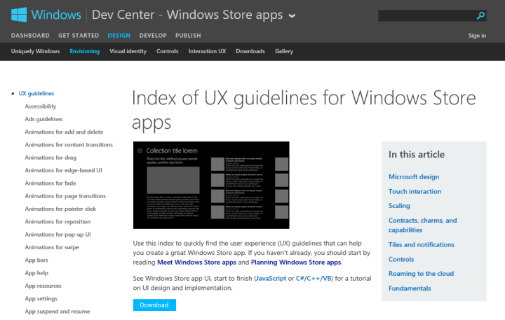
First of all, there are many guidelines for WinRT in the Dev Center and taking a look at them could help you a lot. There is a large amount of reading material, but just browsing or looking at the parts that intrigue you can help you make more beautiful and usable apps more quickly. Here are the links for an overview of Windows Store Apps, UX Guidelines for Windows Store apps and Planning Windows Store apps.
So, since I’ve developed and seen my share of WinRT apps in the last 1.5 years, I have come up with a list of some tips about what not to do in your Windows Store apps. Note that if you are familiar with WinRT, chances are you might already know some – most – all of the items I’m going to list here. But still, simple != unimportant, so take a look and see if there is something you haven’t seen or thought before, because these are the things that help increase the quality of your app.
Well then, let’s start the list. Keep in mind that they are not ordered in any way; I’m writing them as they pop up in my head. 🙂
1) Don’t overuse MessageDialog.
MessageDialog class is the equivalent of the message box in desktop applications: It is the ultimate way of displaying a message to the user or forcing the user to make a choice. It is also extremely easy to use, which can cause the developers to just pop up a MessageDialog and be done with it for nearly every situation. And you can already feel that if abused, it can become very annoying, very quickly, because it interrupts the flow of the user.
For an obvious example on unnecessary MessageDialog use, assume you have an app that performs a long process in the background, like downloading a file using BackgroundDownloader, and this process has a Play / Pause / Stop etc. button that lets you control it. If you use a MessageDialog to display the status of this process, unfortunately you’re doing it wrong.

The responses you’ll get from the user can range from “Thank you Captain Obvious!” to “No #h!₺ Sherlock!”. Therefore, instead of using MessageDialog to show the status, we should instead add a TextBlock to the page and show the status there, therefore never interrupting the flow, like this:
Displaying the status this way is a more pleasing experience for the user.
Now, for a more subtle example, assume that an error occurred while downloading the file. This time you can display a MessageDialog, right? Well, not really. Since we are downloading the file on the background, it is highly probable that the user has navigated to another page and looking at something else (unless he/she likes watching progress bars, but even then, showing the error on the textblock is more appropriate). In that case, we will still be interrupting the user, and the situation will be even worse if we just show a MessageDialog that says “An error occured while downloading file” with an OK button, because the user would then need to navigate to the downloads page to restart the download. We could ask in the MessageDialog if the user wants to go to the Downloads page, but still that doesn’t solve the whole “interrupting” thing. What will we do then?
Let’s look at what Store app does in that case:
It displays that there is an error on the upper right corner of the screen. This way, I’m still browsing the Store but I realize there has been an issue with my downloads and can check it out at my own leisure.
Anyway, if you want to really check out when it is appropriate to use MessageDialogs and what are the alternatives depending on the scenario, check out the Guidelines for message dialogs page on the Dev Center.
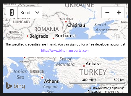
2) Don’t use Bing Maps trial keys when publishing an app.
When using Bing Maps in your app, you need to enter a key, which is used for tracking the amount of your Bing Maps usage. These keys have 3 types: Trial, Basic and Enterprise. Trial and Basic are free (but have usage limits depending on where the keys are used), and the Enterprise keys are priced.
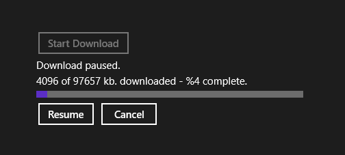
The difference between Trial and Basic is that Trial keys expire after 90 days. If you create a Trial key and then publish your app with it, your map control will look like this after the key expires:
The Basic key is free too, and it doesn’t expire. It is said here on Bing blogs that Basic key can be used up to “500.000 transactions”, when compared to the “10.000” transactions of the Trial key. However, I don’t exactly know what is counted as a “transaction” or how fast would that “500.000” transaction limit would be used up, because questions about these details always seem to be redirected to a rather lengthy Terms of Use document.
tl;dr use a Basic key instead of a Trial key. 🙂
3) Don’t leave your app with default backgrounds, colors, templates, styles, fonts and so on but don’t go overboard with them either.
The default settings in Visual Studio may look good to you when developing, but the fact that they are “default” ensures that if you publish them that way, you are basically starting with minus 50 points in your app design (because you are leaving a lot of design questions blank).
This does not mean “Don’t use default settings”. Instead, this means “Don’t leave all of your settings in their default values”. You don’t have to change everything; just spend a little time about how you can make your app look beautiful.
Some of the changes that I usually apply are:
– Color scheme. First, decide if you want your app to be dark or light themed, then pick two or three main colors that are compatible and use them throughout the app (if you need more variety, using other shades of your chosen colors usually work great).
– Background. For WinRT apps, solid color backgrounds can work nice, but adding a minimalistic background can work wonders too. For example, if you want a white background, you can try putting a gradient color with very little difference, or maybe use an image with abstract shapes. It really makes a big difference. For example, look at the Store app’s backgrounds below:

In Windows 8.
In Windows 8.1
– Fonts. Usually just playing with the font size is enough, and I recommend using Segoe UI and Segoe UI Light (obviously), but sometimes you can try different fonts just to see how they look. You never know what you’ll find.
– Templates. They are the resources that define how a control works, and they are usually the main aspect of your design because in WinRT an item group is mainly displayed in GridViews, ListViews or other controls that have an ItemsTemplate. So, use your color scheme, fonts, images or even paths to make your item templates appealing. They are also extremely effective in making menus for your app, like shown below:

– Finally, styles. They are the resources that define how a control looks, and I have so far used them on Buttons only. But still, you can play with them to make beautiful buttons, and I especially like using AppBarButtons in the app itself (when appropriate, like in the video below).
– As I’ve said at the beginning, though, don’t go overboard. Don’t do something like this:

My eyes hurt.
4) Don’t ever forget about other resolutions, lower or higher.
WinRT apps target a very wide range of resolutions, starting with as low as 1024×768 to 2560×1440 (and even further). To make sure your app looks nice on all of them, you have to take care when placing your controls on to the screen. Plan ahead, make use of margins and dynamic control sizes, and don’t forget to test your app on different resolutions in the emulator.
The problems in lower resolutions usually stem from trying to fit the content to the screen, which can result in some items in your interface getting cut or not displayed. You can usually overcome this situation by lowering the sizes of your controls a little (dynamically, of course) and/or making the content scrollable.
The problems in higher resolution usually come from not having enough content to fill the screen, which can result in large empty spaces in your app. You can minimize it by increasing the sizes of your controls and placing your controls in such a way that as the screen gets bigger, they should still be the focus of attention, not forgotten in the upper left corner of the screen.

Windows 8 is designed for different resolutions, so controls (like the GridView) can be used to automatically show more content as the screen gets bigger. (image taken from a blog post on MSDN that I’ve linked below)
You may also try using the ViewBox control but you have to be very careful about it. ViewBox control stretches the items it contains, effectively zooming in and out as it gets bigger or smaller. This may look like a good solution to you, but the problem is that if you depend on it too much, you can get a very unpleasant display with huge or weirdly stretched controls and texts, and the images that are stretched beyond their original resolution will look blurry.
Resolution issue depends on the exact design of your app, so there are no specific tips here. If you want to know more about “scaling” to different resolutions, look at this post on MSDN.
Speaking of resolution…
5) Don’t forget about snap view and portrait mode.
Snap view became especially important with Windows 8.1 since users can arrange apps in any width they desire. Now, if you make your app considering the resolution issues above, you mostly make your app usable in snap view anyway. Just think about what functionality it can provide when snapped. Then, you can either make sure the sizes of your controls are correct in snap view, or you can design some templates special for snap view in order to list them better. Or maybe take a third option and navigate to a specific page when your app is in snap view.
For example, look at the following list which changes from a GridView to a ListView when snapped by changing the visibilities (or, you can also make a special ItemsTemplate for snap view and just change that template, not the whole control):

I’ve apparently missed the bottom clipping here. -.-
Finally, if you think your app would be useful in Portrait mode, make sure you test how it looks in the emulator and make changes if necessary. If not, make sure you disable it in the app manifest so your app can not be put into Portrait mode.
6) Don’t leave out main features of WinRT, like live tiles, secondary tiles, toast notifications, lockscreen notifications, background tasks and charms.
These features are specific to WinRT platform and therefore they are especially important, and once you learn them it really takes at most 10-15 minutes to add a background task that periodically updates the live tile or notifies the user of something. Also make use of the charms; especially Share and Search charms are quite efficient and can have a big impact on the usability of your app. If you just decide not to use any of these, you’ll be missing out on a lot of potential.
7) If your app needs an internet connection, don’t just check it in the main page and leave it like that.
A very small detail, but if your app needs an internet connection, just checking it when the app starts running isn’t a good idea. You could instead check it at the beginning of every page in your app, but that has its issues as well, so you should instead put every piece of code that uses internet in a try/catch block and then determine when there is no connection.
You may think this is too obvious, but it is something that can be overlooked (I know I did at first). You have to assume that the internet connection can go out at any time, maybe right in the middle of a web method call. The user could even put the computer to sleep mode when your app is running, and when the computer recovers from sleep mode there is a small delay before it can connect to wifi. And, you are going to have error handling for your internet-using-code anyway, so incorporate your internet check in that place and handle it there. Make sure you test that it works, too: Just run your app and cut the internet in the middle of an operation and see if it recovers.
8) Unless your app is very simple, don’t forget to add a logging mechanism.
As your app becomes more complex, the number of things that can go wrong increases too, and you can not foresee every single one of them. Instead of relying on user comments on the marketplace to find the bugs which will inevitably pop up, you should add a logging mechanism to your app in order to retrieve these logs later to see what went wrong and fix them.

Kind of like.. this.
I can think of two ways on how to do this. Whenever an exception is thrown:
– You could save the exception information and the function in which the exception occurred to a database or a file on the internet.
– Or, you could save this information to a file on the disk, and then ask the user if he/she wants to send the logs (privacy reasons).
What you must be careful about is which information you want to gather. If you gather something that can identify a user or a computer, this may come down on you as a privacy issue. And don’t forget to include a statement like “I gather exception information and stuff” in your privacy policy if you want to directly save it over the internet.
9) When publishing your app, don’t declare that your app supports “Accessibility” unless you mean it.
Windows has a lot of different features for “Ease of Use”, targeted to visually or physically handicapped people, and when you are publishing your app to the marketplace you get a check box asking if your app meets accessibility requirements. This allows people to filter these apps in Windows Store.
Now, the issue is, I’ve seen some cases where people just checked it and moved on, without ensuring. However, this is not something to be taken lightly.
For example, let’s say that you have a light themed app, which has a white background (that you explicitly set, like a solid color, gradient color or image) and a black TextBlock and Button. If you do not explicitly set the TextBlock’s and Button’s color properties, they will be using system resources (meaning the values provided by the system). Normally, that is not an issue because you know what values you’ll get from the theme you choose (light or dark), but since you say you can support accessibility, what if the user is using Windows in “High Contrast Black”? Then, the default foreground value we get from the system becomes white, and voila: Your TextBlock and Button can not be seen. Like this (I used a very light shade of gray as background to demonstrate):
How it normally looks.

How it looks on “High Contrast Black”.
“High Contrast Black. Not even once.”
Anyway, you might be saying “Well then, I’ll just explicitly set the colors.”. That might work, but sometimes it isn’t enough, because system resources are used very extensively. You might change the foreground of a Button, but you need to play with its style to change how it looks when it is clicked or disabled. This goes for every other control with states. Heck, even your logo on the live tile or your splash screen may become invisible because of this.
Accessibility doesn’t even just end with visual aspects. There is also the part whether your app can be used with keyboard only (whether you can navigate within the app using arrow keys and Tab), or there are even features for implementing screen reading (so visually impaired people can hear what is written on the screen).
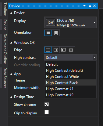
So, what can you do? You can check out this post on the Dev Center about how you can implement accessibility and also test how your app looks in different high contrast options within Visual Studio by previewing them in the Device tab:
Or, just don’t select that “My app supports accessibility” check box if this is not a big deal.
10) Try not to rush your app.
Yes, I know, easier said than done. Deadlines are nearly always tight, but if it is possible, try to spend some time with every aspect of your app and publish it when it feels complete and you’re comfortable with it. For example, instead of creating an app within a week, spend another week if you can (or if you feel you should). An app with half-done features will only get so far, and even if you update it later you will be missing out on the initial impact and will not reach your full potential. Don forget: Slow and steady wins the race.
Well then, my list ends here. As I’ve said, they are simple tips, but we can sometimes lose ourselves in the heat of the moment and forget about simple things. 🙂
If you have any other “simple” tips coming from your experience, don’t forget to leave a comment. 🙂
Thank you for reading and see you in my other articles.
