
When developing a Windows Store app, you get to set the default theme of you app, Dark or Light. This value determines the system brush resources for your app – therefore the colors of your controls. The theme is set in the App.xaml file, and can not be changed in runtime; so we need to pick a theme and stick with it.

An app in Dark theme.
The same app in Light theme.
This is generally not a problem, but as you can guess sometimes you may need to mix things up a little. For example, in your Dark themed app, you may need to have a page with a white background, or if you have a custom background (like a picture), some of your controls may be unseen on a specific part of the picture. When this happens, it can result in your control not being easily seen (or not being seen at all).
To fix this for simple controls that do not have states (like a textblock), just setting the foreground will be enough. However, if you wish to change the color of a more complex control, such as a button, after changing it’s foreground – background – border colors you’ll see that either a) it partially works but the button is not entirely visible when you hover over it, click it, or when it is disabled and thus looks bad, or b) it doesn’t work at all.

The same app, when themes collide.
After spending 2 hours just for the color of single button, I have found a solution (which is definitely not elegant, but it works), and in this article we will make an example app that demonstrates how we can mix these two themes.
However, before going on to our app, let’s just examine why simply just setting the color values of a complex control (with states) won’t work, and how we will solve it.
Here’s a piece of xaml code from the style of a button:
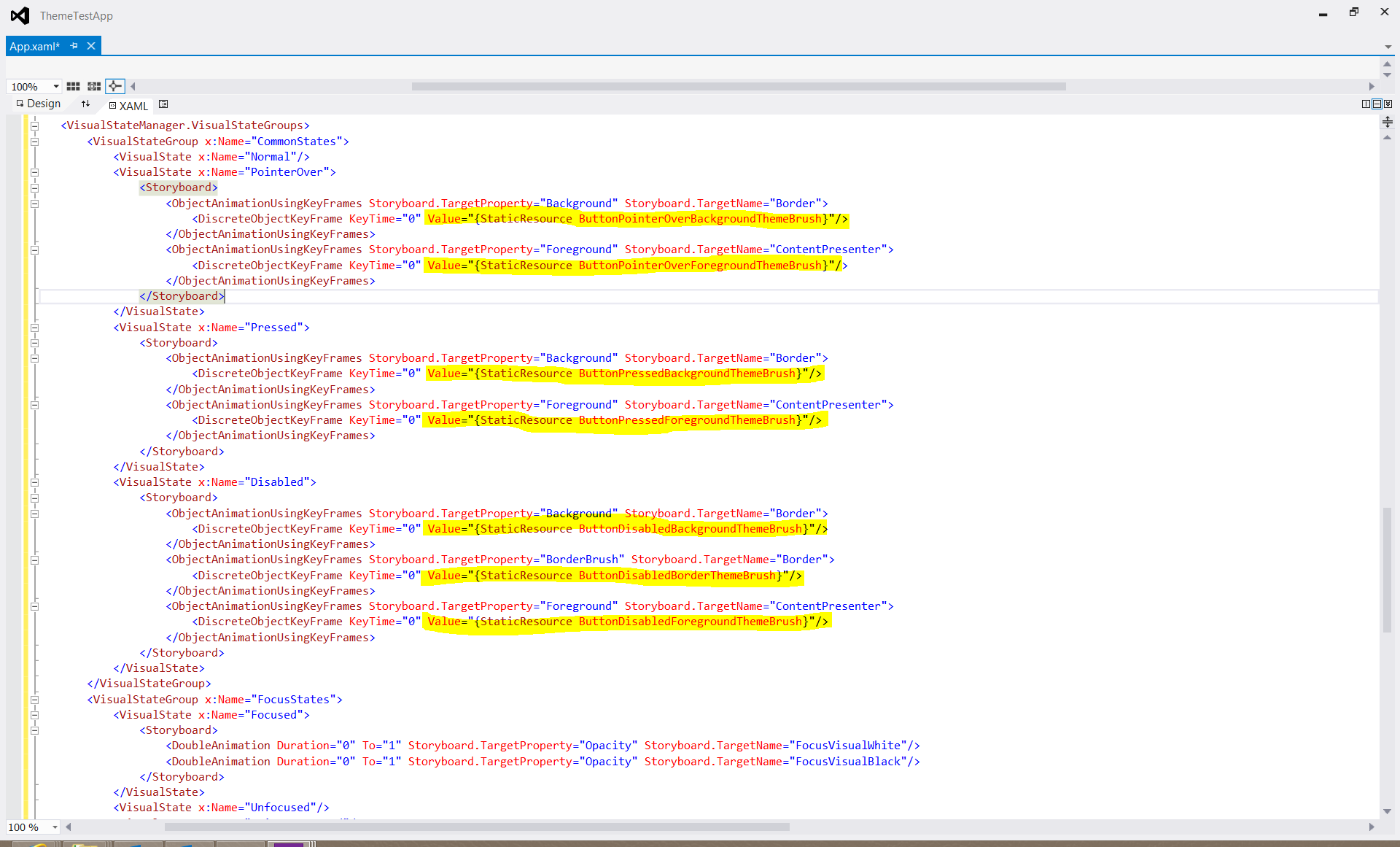
Click the picture to view it in full size.
If you take a look at this code, you’ll see that we have different visual states like pointerover, pressed and disabled. These states are basically animations (storyboards) that set exactly how our button will look when in that state. And in the highlighted parts, you can see that these color values are taken from system resource brushes, which are defined by the theme we’ve set. So this is why we can not just fix our button by setting it’s foreground and background: We need to also change these values for every state.
Alright, now that we’ve found out the source of our problem.. How will we fix it? We need to copy the style of our control, and manually replace these color values with the colors of the theme we want, but where can we find these values? I admit, I’ve tried reading them in Visual Studio one by one, but it is tedious, you’re very likely to make mistakes, it is boring beyond comprehension and you feel like there should be a better way.
And that feeling is correct, there is a better way: Open the following file (in any word editor, but I’ve opened it in a Visual Studio instance): “C:\Program Files (x86)\Windows Kits\8.0\Include\WinRT\Xaml\Design\themeresources.xaml”. This file contains resource dictionaries which contain the values we’re looking for.
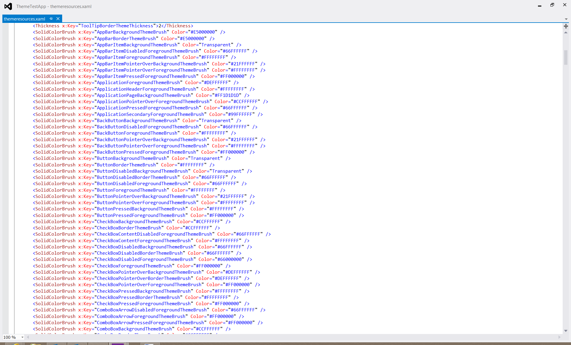
The values we’re looking for.
Now that we know what to do, time to start our example app. 🙂 We will set the theme of our application to Light, but add a second page where the background will be dark and then fix the colors of the back button of that page.
Create a new blank Windows Store application, and add ‘RequestedTheme=”Light”‘ in the App.xaml page:
<Application
    x:Class="MixedThemeApp.App"
    xmlns="http://schemas.microsoft.com/winfx/2006/xaml/presentation"
    xmlns:x="http://schemas.microsoft.com/winfx/2006/xaml"
    xmlns:local="using:MixedThemeApp"
    RequestedTheme="Light">
Next, we’ll add a TextBlock and a Button in our MainPage.xaml file which will be used to navigate to our dark themed page:
        <Button x:Name="ButtonNextPage" Content="Next Page" HorizontalAlignment="Center" Margin="0" VerticalAlignment="Center"/>
        <TextBlock HorizontalAlignment="Center" Margin="0,0,0,120" TextWrapping="Wrap" Text="Light Theme" VerticalAlignment="Center" FontSize="50"/>
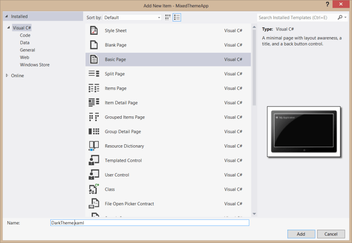
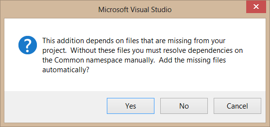
Then, we’ll create a new page in our solution. Right click the project in Solution Explorer, select Add->New Item… and add a new “Basic Page” called DarkTheme.xaml to our project. We’ve added a basic page because it automatically contains a back button which will make this example easier. Visual Studio will probably ask you if it should add “files missing from your workspace”. Select Yes and go ahead.
You may need to build your project once for DarkTheme.xaml to view it in Design view.
After that, we’ll add the following to our DarkTheme.xaml (notice that we’re setting the background of the page, and the foregrounds of the textblocks):
    <Grid Style="{StaticResource LayoutRootStyle}" Background="#FF1D1D1D">
        <Grid.RowDefinitions>
            <RowDefinition Height="140"/>
            <RowDefinition Height="*"/>
        </Grid.RowDefinitions>

        <!-- Back button and page title -->
        <Grid>
            <Grid.ColumnDefinitions>
                <ColumnDefinition Width="Auto"/>
                <ColumnDefinition Width="*"/>
            </Grid.ColumnDefinitions>
            <Button x:Name="backButton" Click="GoBack" IsEnabled="{Binding Frame.CanGoBack, ElementName=pageRoot}" Style="{StaticResource BackButtonStyle}"/>
            <TextBlock x:Name="pageTitle" Grid.Column="1" Style="{StaticResource PageHeaderTextStyle}" Foreground="#DEFFFFFF" Text="Dark Theme"/>
        </Grid>
We’ll also set the Click event of our Button in MainPage.xaml to make it navigate to our dark themed page:
        private void ButtonNextPage_Click(object sender, RoutedEventArgs e)
        {
            Frame.Navigate(typeof(DarkTheme));
        }
Ok then, if we run our application now, this is how our dark theme page will look like since we didn’t fix the colors of the back button:

To correct this using the way I’ve described above, first right click the back button in DarkTheme.xaml, select Edit Template -> Edit a Copy…, name it DarkThemeBackButtonStyle and select define in Application.

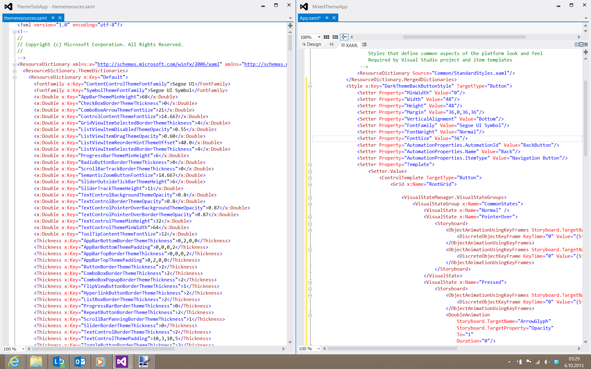
App.xaml will open, showing you the xaml code of the style you’ve just created. Now, open “C:\Program Files (x86)\Windows Kits\8.0\Include\WinRT\Xaml\Design\themeresources.xaml”. Put these two files side by side to get a good view of them at the same time, like this:
The values of Dark theme is in “<ResourceDictionary x:Key=”Default”>”. The values of Light theme is in “<ResourceDictionary x:Key=”Light”>”. Since we need to get the Dark theme values, we’ll use the former. Now, replace the resources in your DarkThemeBackButtonStyle with the values from the themeresources.xaml file (as shown below):
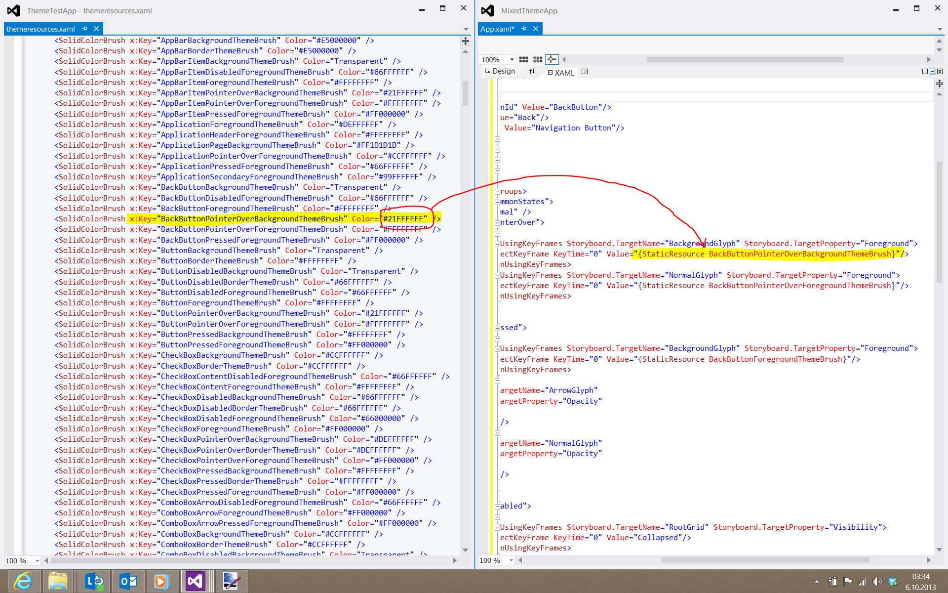
Do this for every resource in the DarkThemeBackButtonStyle (except for “FocusVisualWhiteStrokeThemeBrush” and “FocusVisualBlackStrokeThemeBrush”, they are same in all themes). The result will look like this:
<Style x:Key="DarkThemeBackButtonStyle" TargetType="Button">
<Setter Property="MinWidth" Value="0"/>
<Setter Property="Width" Value="48"/>
<Setter Property="Height" Value="48"/>
<Setter Property="Margin" Value="36,0,36,36"/>
<Setter Property="VerticalAlignment" Value="Bottom"/>
<Setter Property="FontFamily" Value="Segoe UI Symbol"/>
<Setter Property="FontWeight" Value="Normal"/>
<Setter Property="FontSize" Value="56"/>
<Setter Property="AutomationProperties.AutomationId" Value="BackButton"/>
<Setter Property="AutomationProperties.Name" Value="Back"/>
<Setter Property="AutomationProperties.ItemType" Value="Navigation Button"/>
<Setter Property="Template">
<Setter.Value>
<ControlTemplate TargetType="Button">
<Grid x:Name="RootGrid">
<VisualStateManager.VisualStateGroups>
<VisualStateGroup x:Name="CommonStates">
<VisualState x:Name="Normal" />
<VisualState x:Name="PointerOver">
<Storyboard>
<ObjectAnimationUsingKeyFrames Storyboard.TargetName="BackgroundGlyph" Storyboard.TargetProperty="Foreground">
<DiscreteObjectKeyFrame KeyTime="0" Value="#21FFFFFF"/>
</ObjectAnimationUsingKeyFrames>
<ObjectAnimationUsingKeyFrames Storyboard.TargetName="NormalGlyph" Storyboard.TargetProperty="Foreground">
<DiscreteObjectKeyFrame KeyTime="0" Value="#FFFFFFFF"/>
</ObjectAnimationUsingKeyFrames>
</Storyboard>
</VisualState>
<VisualState x:Name="Pressed">
<Storyboard>
<ObjectAnimationUsingKeyFrames Storyboard.TargetName="BackgroundGlyph" Storyboard.TargetProperty="Foreground">
<DiscreteObjectKeyFrame KeyTime="0" Value="#FFFFFFFF"/>
</ObjectAnimationUsingKeyFrames>
<DoubleAnimation
Storyboard.TargetName="ArrowGlyph"
Storyboard.TargetProperty="Opacity"
To="1"
Duration="0"/>
<DoubleAnimation
Storyboard.TargetName="NormalGlyph"
Storyboard.TargetProperty="Opacity"
To="0"
Duration="0"/>
</Storyboard>
</VisualState>
<VisualState x:Name="Disabled">
<Storyboard>
<ObjectAnimationUsingKeyFrames Storyboard.TargetName="RootGrid" Storyboard.TargetProperty="Visibility">
<DiscreteObjectKeyFrame KeyTime="0" Value="Collapsed"/>
</ObjectAnimationUsingKeyFrames>
</Storyboard>
</VisualState>
</VisualStateGroup>
<VisualStateGroup x:Name="FocusStates">
<VisualState x:Name="Focused">
<Storyboard>
<DoubleAnimation
Storyboard.TargetName="FocusVisualWhite"
Storyboard.TargetProperty="Opacity"
To="1"
Duration="0"/>
<DoubleAnimation
Storyboard.TargetName="FocusVisualBlack"
Storyboard.TargetProperty="Opacity"
To="1"
Duration="0"/>
</Storyboard>
</VisualState>
<VisualState x:Name="Unfocused" />
<VisualState x:Name="PointerFocused" />
</VisualStateGroup>
</VisualStateManager.VisualStateGroups>
<Grid Margin="-1,-16,0,0">
<TextBlock x:Name="BackgroundGlyph" Text="" Foreground="Transparent"/>
<TextBlock x:Name="NormalGlyph" Text="{StaticResource BackButtonGlyph}" Foreground="#FFFFFFFF"/>
<TextBlock x:Name="ArrowGlyph" Text="" Foreground="#FF000000" Opacity="0"/>
</Grid>
<Rectangle
x:Name="FocusVisualWhite"
IsHitTestVisible="False"
Stroke="{StaticResource FocusVisualWhiteStrokeThemeBrush}"
StrokeEndLineCap="Square"
StrokeDashArray="1,1"
Opacity="0"
StrokeDashOffset="1.5"/>
<Rectangle
x:Name="FocusVisualBlack"
IsHitTestVisible="False"
Stroke="{StaticResource FocusVisualBlackStrokeThemeBrush}"
StrokeEndLineCap="Square"
StrokeDashArray="1,1"
Opacity="0"
StrokeDashOffset="0.5"/>
</Grid>
</ControlTemplate>
</Setter.Value>
</Setter>
</Style>
Build and run the app now, and you’ll see the following:

There you go. 🙂 You need to do this once for each control you wish to use in different theme. You can then apply the style to as many controls as you wish.
As I’ve said, it’s not elegant, but it works. 🙂 And here‘s the source code for our example.
I hope this has been helpful. See you tomorrow in my next boredom challenge article.
 Alp Arslan Eren
This one is helpful ! Thanks.
I have the same issue with an HTML/JS windows 8 app. The problem is when the back button is pressed it keeps the last linked css. Any ideas?
Unfortunately I haven’t worked on HTML/JS Win 8 apps, so I don’t have any ideas about that problem.