When developing a Windows Store app, you get to set the default theme of you app, Dark or Light. This value determines the system brush resources for your app – therefore the colors of your controls. The theme is set in the App.xaml file, and can not be changed in runtime; so we need to pick a theme and stick with it.
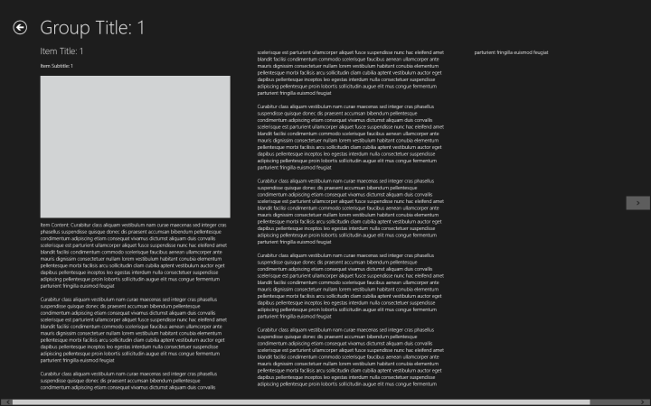
An app in Dark theme.
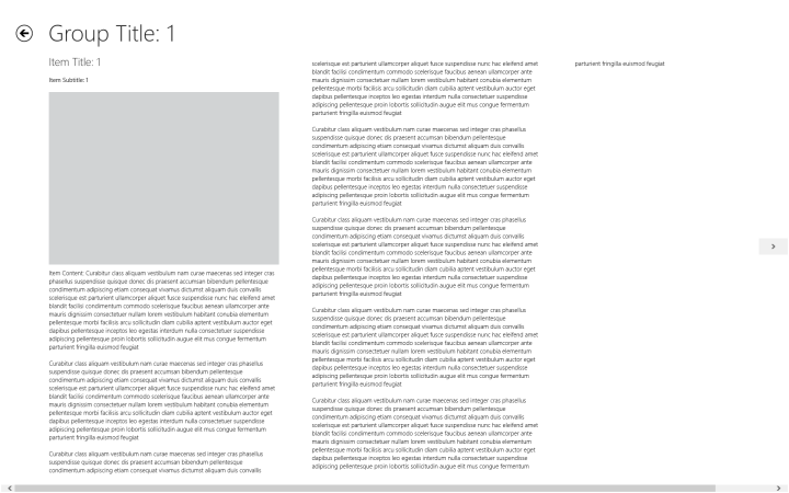
The same app in Light theme.
This is generally not a problem, but as you can guess sometimes you may need to mix things up a little. For example, in your Dark themed app, you may need to have a page with a white background, or if you have a custom background (like a picture), some of your controls may be unseen on a specific part of the picture. When this happens, it can result in your control not being easily seen (or not being seen at all).
To fix this for simple controls that do not have states (like a textblock), just setting the foreground will be enough. However, if you wish to change the color of a more complex control, such as a button, after changing it’s foreground – background – border colors you’ll see that either a) it partially works but the button is not entirely visible when you hover over it, click it, or when it is disabled and thus looks bad, or b) it doesn’t work at all.

The same app, when themes collide.
After spending 2 hours just for the color of single button, I have found a solution (which is definitely not elegant, but it works), and in this article we will make an example app that demonstrates how we can mix these two themes.
➤ Let’s make our app look like Yin Yang ☯☯☯☯☯☯☯☯☯☯☯☯☯☯☯


 Alp Arslan Eren