
In my previous article, I’ve talked about some XAML controls which I never needed to use or learn what they are for. In this article, I’ll continue this concept and write about the Properties in WinRT (or .NET, in general) that I didn’t need to use, not even once in years, and how they work.

A glance of our Properties panel.
1) UIElement.AllowDrop Property
As the name suggests, this property allows our UIElement to be a target of a drag and drop operation. However, this property only defines that it can be a drop target, so we’d need to implement this dragging feature ourselves. (If you would like to learn how we can do this, take a look at this article.)
2) UIElement.CacheMode Property
The definition of CacheMode property says that CacheMode value indicates if rendered content should be cached as a composite bitmap when possible. The practical meaning of this is that, if we set a cache mode, the rendering operations from RenderTransform and Opacity properties will be executed on the GPU.
Apparently, this is an advanced feature for complex UIs to gain performance.
3) UIElement.Clip Property
Clip property defines the outline of an element; that is, the shape in which the contents of the UIElement will be displayed. The content remaining outside this shape will be “clipped” when rendering, hence the name. In WinRT, this shape can only be a Rectangle, but in WPF, it can also be an Ellipse.

An Image without Clip property.
The same Image, with a small valued Clip property.
4) UIElement.IsHitTestVisible Property
Hit testing is determining the point of the user input (the place of the mouse, or the place you’ve touched) and checking if it is coinciding with an element that is drawn on the screen. If this property is set to false, you can not interact with that UIElement graphically, so your touches and clicks won’t be registered for that element. (You could still select it via pressing tab key, if it is supported).
5) UIElement.ManipulationMode Property
ManipulationMode property defines how the gestures and other interactions work on a UIElement. The default value is usually System (and for some controls, None). If the value is System, the interaction is handled by WinRT (for example, a ScrollViewer will scroll its contents based on the interaction).
However, if you are going to create your own control and want to handle the interactions yourself, you can set it to values other than System or None (it can even support multiple values at the same time) and then use the manipulation related events of your control to handle the interaction (like ManipulationStarted, ManipulationDelta, ManipulationCompleted etc.). For example, you could make a “dial” control this way which will turn the dial (with Rotate selected as ManipulationMode) when the user uses the mousewheel over the control (of course, this is easier said than done :)).
6) FrameworkElement.Tag Property
Tag property is used to store custom information about an object, and this information can either be a string or an object itself. Think of it as an “extra” property that you can use to hold whatever you need.
For example, you could store how many times a button was clicked in its Tag property, which would be especially useful if you needed to create buttons dynamically.
7) UIElement.Transitions and Panel.ChildrenTransitions Properties
A Transition is the “visual behaviour” (as said in MSDN) that occurs when a pre-defined action or state change happens for the UIElement. What this means is that, it is the animation that plays in specific situations, such as adding an item to a list or repositioning the element.
The UIElement.Transitions property is a collection of Transitions that affect the UIElement itself, and the Panel.ChildrenTransitions is a collection of Transitions applied to the items (children) of the current UIElement.
Take a look at this article by Colin Eberhardt to view the details of Transitions, and check out the following video to see them in action:
8) TextBox.InputScope Property
InputScope property tells the operating system what kind of input is expected (such as Number, URL, Chat etc.) so the operating system could provide a specialized soft keyboard for this purpose (if possible).

The default touch keyboard when InputScope is set to TelephoneNumber.
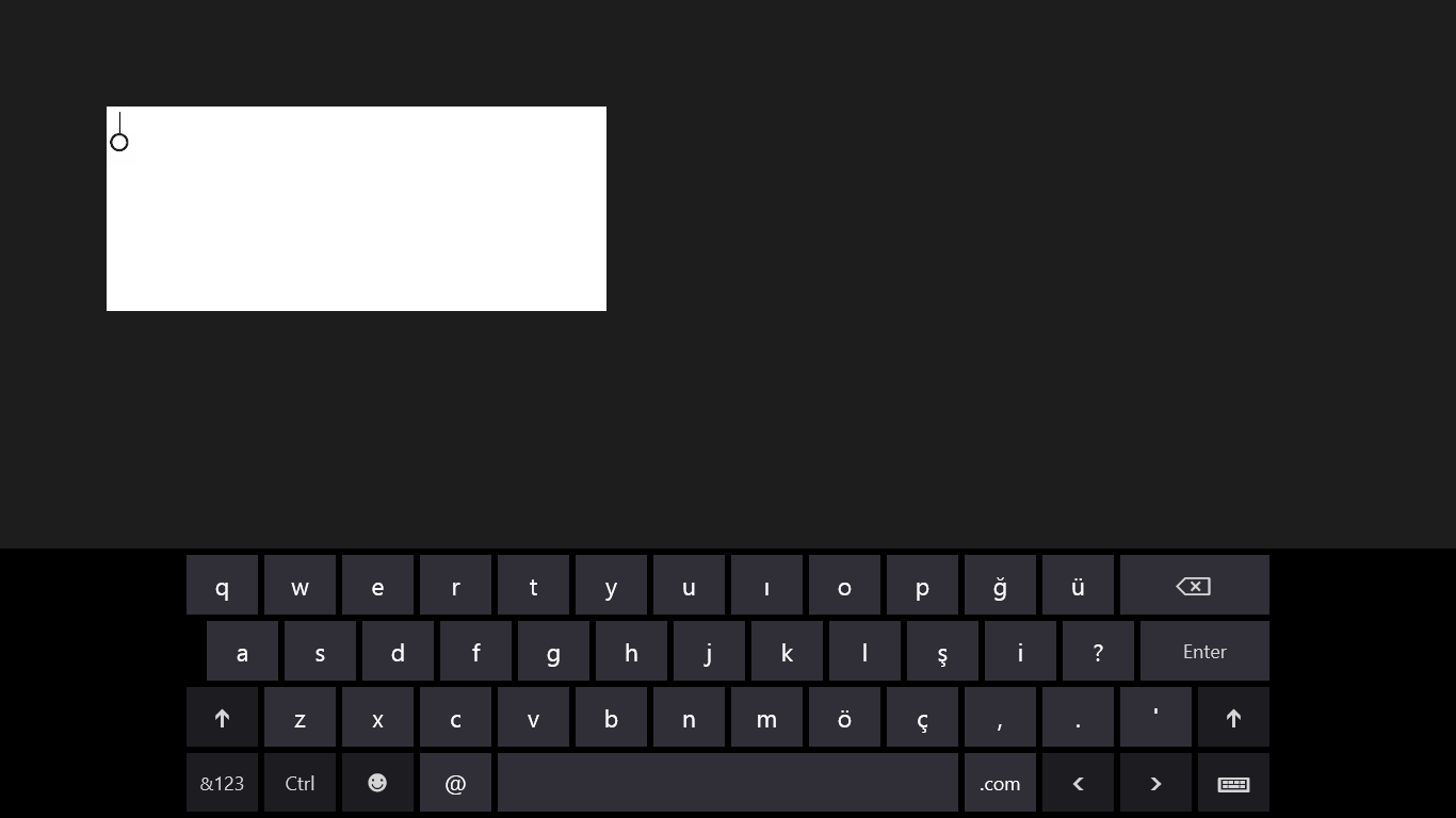
The default touch keyboard when InputScope is set to EmailSmtpAddress (notice the @ symbol added near spacebar).
9) UIElement.UseLayoutRounding Property
UseLayoutRounding property defines whether to round the measurements of an object while rendering it to match whole pixels. This means that sometimes the object measurement may cause the object to be drawn between two pixels, and if that is the case the measurement will be rounded to a full pixel so it would look sharper.
The default value of this property is true, and even MSDN does not list when setting this property to false would be advantageous. When set to false, the edges of our object could look blurry and in a dimmer color. So it’s best we leave it be. 🙂
—
And that concludes our list for less used properties in WinRT. Hope it’s been useful and given you some insight about how they work.
Thank you for reading.
 Alp Arslan Eren