
I’ve developed apps for desktop (using WPF and Silverlight), Windows Phone and WinRT for about 3 years now, and one thing that I’ve noticed is that there are some XAML controls which I never needed to use and have no idea what they are for. So, today I’ve decided to search around and play with those controls to find out what their purposes are. 🙂

A glance of our Toolbox.
In this article, we’ll look around the Toolbox for controls in WinRT that are not so commonly used and see what they are used for and how they work.
Note: I’m writing this article from my point of view (says Captain Obvious). I mean, some of them may not be “less used” for you; I may not just needed to use them so far.
1) Pointer
You see that at the top of each and every tab in Toolbox, there is an item called Pointer. However, if you try to drag and drop it to the Designer it won’t work, and you can’t just add a Pointer control to the xaml code like <Pointer/>. Well, this is because Pointer isn’t a control. 🙂
Pointer is used in the following scenario: Assume you’re going to add a control to your app, like a Button. You select the Button in the Toolbox, and instead of dragging it to the designer, you wish to click on a location on the designer to add the button there. However, halfway through, you change your mind and wish to select something else on the designer, but you can’t click anywhere or you would add a Button. So, you go to the Toolbox and select Pointer instead, and return to the designer and select whatever you wish.
This is what Pointer is for: It allows you to clear your current Toolbox selection. 🙂
2) CaptureElement
CaptureElement in WinRT allows you to display a video stream from a device, like a webcam or camera.
3) ContentControl
A ContentControl is a control that can have a single piece of content; such as a string, a UIElement or a control that contains multiple UIElements. This is usually used in controls that can have their content set by the developer, e.g. the content of a Button. So we can set the content of a Button to a string or another UIElement.
If we turn on the silliness switch of the article, we can put a Button within a Button.. within a Button, within another Button and so on.
        void MainPage_Loaded(object sender, RoutedEventArgs e)
        {
            Button button1 = new Button();
            Button button2 = new Button();
            Button button3 = new Button();
            button3.Content = "BUTTONCEPTION!";

            button2.Content = button3;
            button1.Content = button2;
            ButtonMain.Content = button1;
        }

We need to go deeper.
Bonus points for making the click events of those buttons call each other. (Protip: This makes the app crash.)
4) ContentPresenter
ContentPresenter is used with ContentControl above, and defines where and how the ContentControl will be displayed. For example, in Button, it is defined to be horizontally and vertically centered inside the borders of the Button.
5) HyperlinkButton
HyperlinkButton is basically a button that looks like a textblock, which navigates to a URI that you set (in its NavigateURI property) when clicked.
<HyperlinkButton Content="Please visit my blog." HorizontalAlignment="Left" Margin="100,100,0,0" VerticalAlignment="Top" NavigateUri="http://eren.ws"/>

6) ItemsControl and ItemsPresenter
ItemsControl is just like the ContentControl we’ve explained above, but this time it is for lists. It is a control that can contain several string, objects or other UIElements. It is used in every control that keeps a list of items and has ItemsSource and Items properties.
And as you can guess, ItemsPresenter is the equivalent of ContentPresenter for lists, and defines how ItemsControl will be displayed.
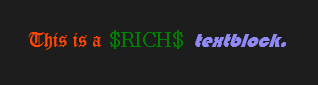
7) RichTextBlock
A RichTextBlock is just like a TextBlock, but contains multiple “blocks” of text instead of just a string. Each of these blocks can have different styles, fonts, sizes and colors; so basically you have a TextBlock where you can have different kinds of text all in one place.
8) RichEditBox
RichEditBox, as you can understand from the name, is a TextBox for editing rich text. However, from what I’ve seen, its usage is a little bit tricky, so I’m not going to dig into its details.
9) RichTextBlockOverflow
RichTextBlockOverflow is used when the content of a RichTextBlock (or another RichTextBlockOverflow) is too long to fit and you wish to continue showing it somewhere else. For example, you may want to have two columns of rich text and an image in between. In this case, you put the RichTextBlock to the left column, the image to the center, and the RichTextBlockOverflow to the right, and then set the OverflowTargetContent of the RichTextBlock to the RichTextBlockOverflow. If the content is too long to show in left column, it will automatically continue in the right column, like this:

10) ScrollContentPresenter
This control is the ContentPresenter equivalent for ScrollViewer controls, which determines how the scrollable content of a ScrollViewer will be displayed.
11) Tooltip
Actually, I believe we all know what a tooltip is. It is the text displayed when you hover over something, and it is mostly used for explanation of what a control will do, or maybe show a value for that control (like a Slider). And, the Tooltip control in WinRT is used exactly for this purpose: You can use it to show tooltips to the user.

12) WrapGrid and VariableSizedWrapGrid
The WrapGrid is a control which contains a list of items, and uniformly displays them sequentially either from left to right or top to bottom, and when the edge is reached, it continues displaying these items in the next row or column. The “uniform” part here means that each item in WrapGrid will have the same size.
A better explanation would be this: WrapGrid is the control that displays the items in a GridView.

An example GridView that uses WrapGrid.
The VariableSizedWrapGrid control, however, is a WrapGrid that allows us to have differently sized items in a WrapGrid. This is done by setting a row and column size, and then setting how many rows and columns each individual item will span. If you would like a working example, I’ve used it in one of my previous articles.

An example GridView that uses a VariableSizedWrapGrid.
13) ViewBox
ViewBox is a control that scales its contents. It is mostly used if you want the interface of your application to scale to the screen resolution: You wrap a ViewBox around your interface and set it to dynamicaly resize itself based on the screen size. Be careful when using it, though, as containing bitmap images in it and incorrect usage can make your app look really awful on specific resolutions.
14) VirtualizingStackPanel
VirtualizingStackPanel is the GridView’s WrapGrid equivalent for ListView and ListBox controls. This means that it displays the items in it uniformly in a horizontally or vertically stacked sequence. The “virtualizing” part of its name comes from the fact that it creates only the items visible on the screen. So you could have 100 items in your ListView, but if the screen is large enough to show only 10 of them, only UI elements for these 10 items will be created, which can prevent performance issues if there is a large number of items. When the user scrolls, the visible items will be recalculated and UI elements will be recreated for those new items.
—
And that concludes our list of less used XAML controls in WinRT.
Thank you for reading, and I hope it was useful and/or fun. 🙂
 Alp Arslan Eren
you rocking sir………..ur coding very usefyl for us….thnk u so much