
In XAML, styles are resources which define the appearance of a control. By creating new styles (or modifying existing ones), you can customize how a control looks to have a more creative and beautiful interface. Since styles are resources, you can just create one that suits your needs and apply it to any suitable control you want.
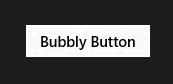
However, when you create (or modify) a style, if you define everything in it explicity, you will be left with a very inflexible control which you can not further customize. For example, assume we have a bubbly button which has many small circles around it that represents the bubbles, like this:

I’ve added these bubbles explicitly with white color, so they will stay white no matter what. But what if I decide to use the button with a different background color in different parts of the app?
The circles are barely visible now.
A solution to that would be creating a different style for each different color you would use, but that would be tedious and ineffective to say the least. Instead, why don’t we tell the bubbles to have the same color with the Button object’s Foreground property? This way, the style would just add the bubbles without specifying their color and we could set the color of each individual Button object the way we want. Sounds good, right?
Well, what I just described is called template-binding. Within a style or template, you can tell a property to get its value from the object that the template or style is applied to. You can template-bind any compatible properties together to achieve your desired effect.
And in this article, we’ll create a sample project which uses template-binding in order to create… EVIL BUTTONS!!1 *insert evil laugh here*
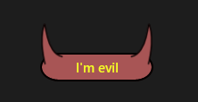
This is an evil button with horns. Notice that the horns get their fill and border colors from the Button object.
Since this is design related and we don’t have to write any code, we’ll be using Blend. We’ll start by creating a new blank Windows Store app project in Blend.

When the project opens, draw a Button object on the artboard by dragging one from the Assets panel on the upper left corner of the screen, then right-click it, select Edit Template and click Edit Copy. This will allow us the create a copy of the default button style and modify it.


If you define the style in Application, it will be stored in App.xaml and can be used from anywhere within your application. If you define it in your Page document, then you can use it only within this page.
After clicking OK, you’ll come into the editing scope of the template. In the Objects and Timeline panel to the left, you’ll see that the template consists of the following objects:

Grid object is our main layout container, Border object is used for displaying the border around the button, ContentPresenter is used for displaying the content of the Button, and FocusVisualBlack and FocusVisualWhite are two rectangles that are used when the button has focus.
Now, we will need to add our horns into the template, under the Grid. To do this, we have to use the Pen tool and draw them as Path objects (which may not be easy if you are using it for the first time). You can practice how to use Pen tool now (use it together with Direct Selection tool to modify the vertices of the Path), or check this link to see the official documentation about drawing Shapes and Paths. Anyway, I have drawn it, so if you need you can just copy/paste the following code within the XAML code of the template to draw them. If you get stuck here, just jump to the end of the article and download the completed project so you can understand it better.
In their default values, the horns will look like the following:

<Style x:Key="EvilButtonStyle" TargetType="Button">
			<Setter Property="Background" Value="{ThemeResource ButtonBackgroundThemeBrush}"/>
			<Setter Property="Foreground" Value="{ThemeResource ButtonForegroundThemeBrush}"/>
			<Setter Property="BorderBrush" Value="{ThemeResource ButtonBorderThemeBrush}"/>
			<Setter Property="BorderThickness" Value="{ThemeResource ButtonBorderThemeThickness}"/>
			<Setter Property="Padding" Value="12,4,12,4"/>
			<Setter Property="HorizontalAlignment" Value="Left"/>
			<Setter Property="VerticalAlignment" Value="Center"/>
			<Setter Property="FontFamily" Value="{ThemeResource ContentControlThemeFontFamily}"/>
			<Setter Property="FontWeight" Value="SemiBold"/>
			<Setter Property="FontSize" Value="{ThemeResource ControlContentThemeFontSize}"/>
			<Setter Property="Template">
				<Setter.Value>
					<ControlTemplate TargetType="Button">
						<Grid>
							<VisualStateManager.VisualStateGroups>
								<!-- a lot of stuff here -->
							</VisualStateManager.VisualStateGroups>
							<Border x:Name="Border" BorderBrush="{TemplateBinding BorderBrush}" BorderThickness="{TemplateBinding BorderThickness}" Background="{TemplateBinding Background}" Margin="3">
								<ContentPresenter x:Name="ContentPresenter" AutomationProperties.AccessibilityView="Raw" ContentTemplate="{TemplateBinding ContentTemplate}" ContentTransitions="{TemplateBinding ContentTransitions}" Content="{TemplateBinding Content}" HorizontalAlignment="{TemplateBinding HorizontalContentAlignment}" Margin="{TemplateBinding Padding}" VerticalAlignment="{TemplateBinding VerticalContentAlignment}"/>
							</Border>
							<Rectangle x:Name="FocusVisualWhite" IsHitTestVisible="False" Opacity="0" StrokeDashOffset="1.5" StrokeEndLineCap="Square" Stroke="{ThemeResource FocusVisualWhiteStrokeThemeBrush}" StrokeDashArray="1,1"/>
							<Rectangle x:Name="FocusVisualBlack" IsHitTestVisible="False" Opacity="0" StrokeDashOffset="0.5" StrokeEndLineCap="Square" Stroke="{ThemeResource FocusVisualBlackStrokeThemeBrush}" StrokeDashArray="1,1"/>
							<Path Data="M-3.03218,23.533 C-3.03218,23.533 -10.6291,-3.06068 -4.30689,-21.3869 C-2.07942,-27.8437 -3.12797,11.3177 17.1767,14.9102" HorizontalAlignment="Left" Height="46.333" Margin="4.306,-29.708,0,0" Stretch="Fill" UseLayoutRounding="False" VerticalAlignment="Top" Width="24.694" Fill="White" Stroke="Black"/>
							<Path Data="M-3.03218,23.533 C-3.03218,23.533 -10.6291,-3.06068 -4.30689,-21.3869 C-2.07942,-27.8437 -3.12797,11.3177 17.1767,14.9102" HorizontalAlignment="Right" Height="46.333" Margin="0,-29.708,4.306,0" Stretch="Fill" UseLayoutRounding="False" VerticalAlignment="Top" Width="24.694" RenderTransformOrigin="0.5,0.5" Fill="White" Stroke="Black">
								<Path.RenderTransform>
									<CompositeTransform ScaleX="-1"/>
								</Path.RenderTransform>
							</Path>
						</Grid>
					</ControlTemplate>
				</Setter.Value>
			</Setter>
		</Style>
After adding the horns in any way you want, click on the Border object in Objects and Timeline panel and set its CornerRadius property to 20, in order to give it a curvy look. Also set the StrokeThickness property for both Path objects to 1.5.


Now, here comes the important part. To template-bind the Path objects’ properties, select one of them in the Objects and Timeline panel, and under Brush category in the Properties panel, click the little square near the Fill property, point to Template Binding and select Background. The little square near the Fill property will then turn to orange to indicate it is binded.
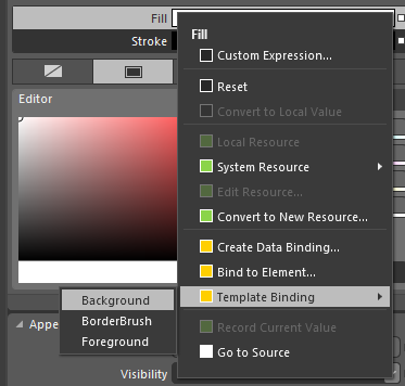

Do the same for Stroke property, but select BorderBrush for it, and then template-bind the Fill and Stroke properties of the second Path object. In the end, the button look like this because there isn’t a Background value yet and the BorderBrush is white:

Our evil style is now ready. 🙂 Press Ctrl+Shift+S to save all files, then return to the editing scope of MainPage.xaml by clicking “Return scope to [Page]” next to EvilButtonStyle in Objects and Timeline panel.

Now, change the background and border colors of the button to see how it looks. 🙂 You can also add another button and apply the style to it (under the Miscellaneous category of the Properties panel). To test them, you can press F5 to compile and run the project.
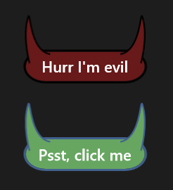
Aren’t they beautiful? You can even make cute faces with them! 😀

I’m Batman.

Satan disapproves.

( ͡° ͜ʖ ͡°)
I’m having way too much fun with this. 😀
As a side note, however, if you try to use the buttons now, you’ll see that the Path objects we’ve added will not respond to the Button’s states (PointerOver, Presed etc.). To do that, you have to set how they will look like in those states, from the States panel while editing the template.
Also as another side note, you can not animate template-binded properties. For example, you can not gradually animate from a template-binded color to another color. If you want the explanation for this, the answer in this topic explains it. If you want to do something like that, creating a storyboard in code-behind is a better way.
You can get the full source code from here.
Thank you very much for reading. This was a very fun topic and I hope to see you in my next articles. 🙂
 Alp Arslan Eren